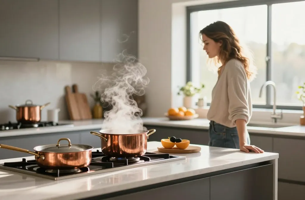
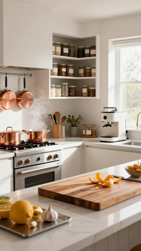
An evocative, steam-filled kitchen sits in your mind’s eye: copper pans glinting above a chaotic countertop, a scent of garlic and citrus hanging in the air, and the soft hum of a fridge that somehow looks like a trusted friend. You can almost taste the coffee cooling on the counter and hear the sizzle that tells you you’re in your happy place. This is the kitchen you want—functional, stylish, easy to live in. And yes, it’s possible without sacrificing your sanity for the sake of a perfect Instagram shot.
What if I told you there’s a core philosophy behind getting a timeless kitchen design right that makes or breaks everything? It’s simple, really: prioritize flow, define zones, and let practical decisions lead the aesthetic. When you design with real life in mind, you stop chasing trends and start building a space that works as hard as you do.
If you’ve ever sighed over a messy countertop, battled door swing chaos, or wondered why your pantry looks like a black hole, you’re not alone. Timeless kitchen design is a playground of compromises, and most of us stumble into the same traps. The good news? There’s a clear path out. You can finally cook with confidence, entertain without chaos, and still have a space that looks intentionally gorgeous.
Let’s be real: you’re not failing, you’re misfiring. The kitchen is a living room for meals, moods, and a little chaos. You deserve a setup that supports good meals and good vibes. FYI, you don’t need a designer’s budget to fix these common missteps. With a few targeted tweaks, you’ll elevate your kitchen from “meh” to “chef’s kiss.”
The Layout Dilemma: Why Space Is Your Secret Ingredient
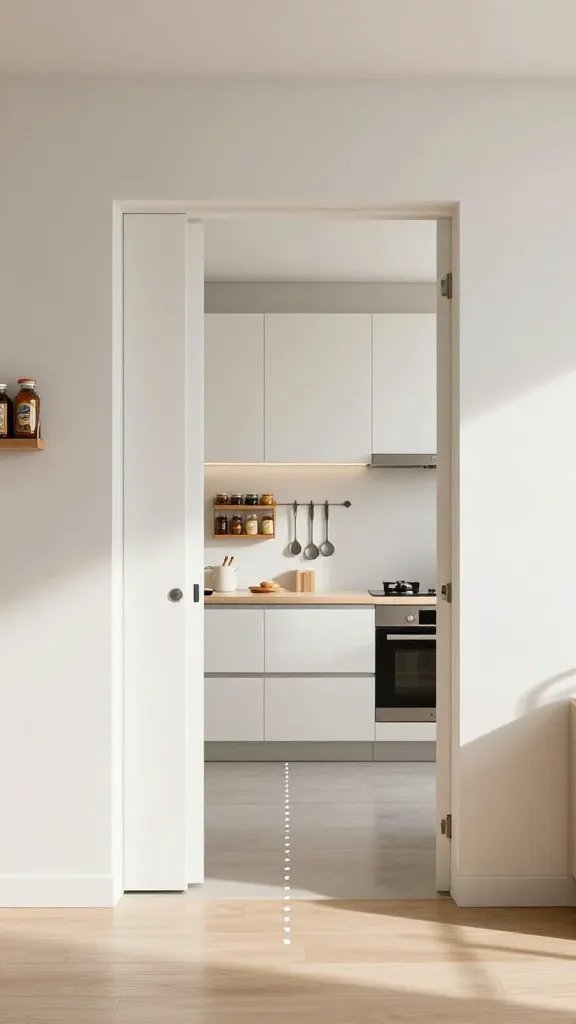
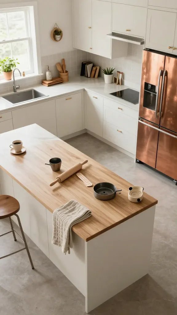
We’ve all walked into a kitchen that feels like a maze. A fridge that blocks the entry, an island that steals all the prep space, or a sink that’s somehow never where you need it. The layout is the backbone of your day-to-day cooking. If it’s off, everything else feels off, too.
– Start with a work triangle you actually use: fridge, sink, stove. It’s not a relic from design class; it’s your daily workflow. If you juggle more than three steps between these points, you’re just adding friction.
– Embrace zones, not rules: prep, cooking, cleaning, and storage shouldn’t fight for space. They should politely coexist like roommates who actually clean up after themselves.
– Flow matters more than wow: a gorgeous kitchen that forces you to sprint around the room every time you grab a utensil is not a win. Function first, aesthetics second.
If your kitchen currently rejects your attempts to cook without tripping over the trash can, you’re not imagining things. The solution often lies in rethinking the island’s footprint, repositioning the sink, or swapping a double-door fridge for something that doesn’t block the main path.
The Countertop Conundrum: One Surface to Rule Them All (And Your Chopping Board)
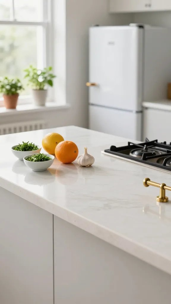
Counter space is sacred. It’s where meals materialize, coffee cools, and the occasional laptop cameo happens. Too little space, and you feel squeezed; too much, and you end up with dead zones where clutter festers.
– Pick a secondary prep area: a folding table, a rolling cart, or a butcher block can live near the main prep zone and give you breathing room without stealing all your real estate.
– Plan for the inevitable spread: use small, removable organizers for utensils, spices, and prep bowls. They can be tucked away when guests arrive, then re-emerge when you’re back to chopping onions at lightning speed.
– Consider material realities: quartz looks sleek but can scratch; granite is timeless but needs sealing; solid wood warms a kitchen but may require more maintenance. Pick what fits your vibe and life.
A common mistake is treating every square inch as sacred. In reality, your counter should be a mix of open, usable space and smartly tucked storage. The goal is to have enough flow for a few culinary experiments without the stress of a constantly commercial kitchen setup.
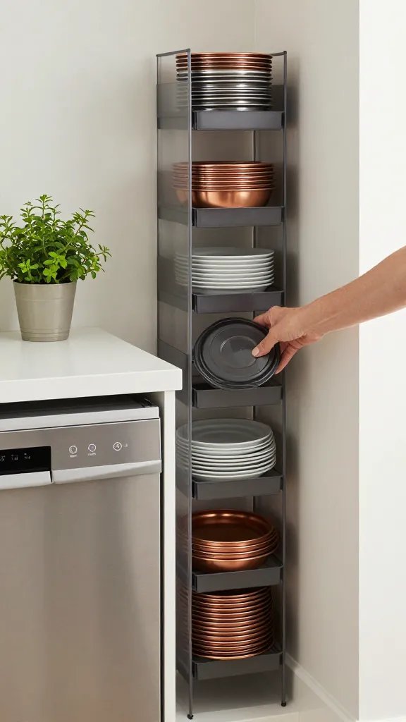
Storage That Actually Keeps Its Cool
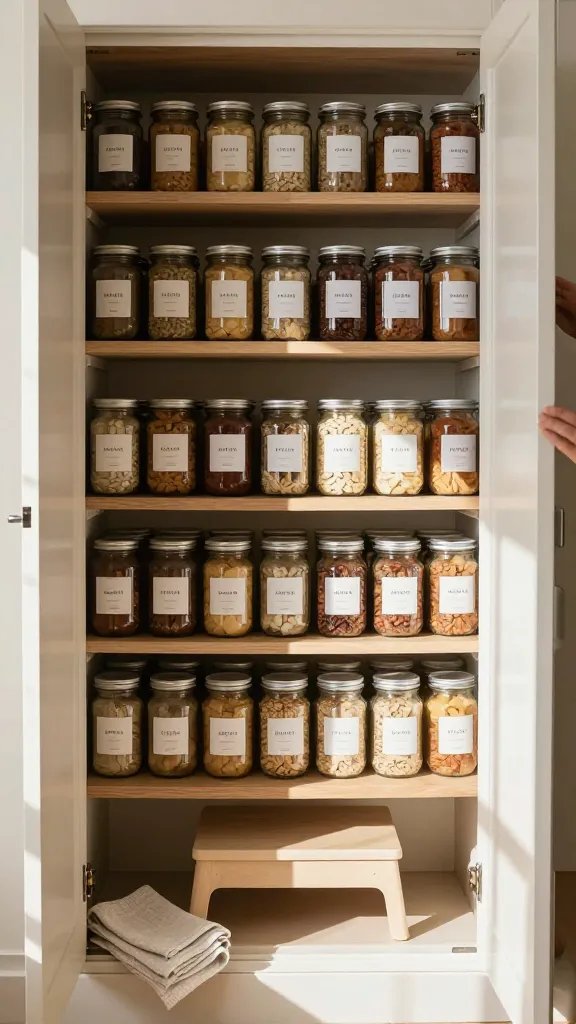
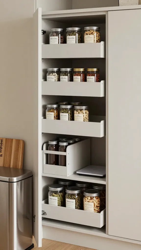
Open shelves are gorgeous until they’re a magnet for chaos. Closed cabinets feel safe but hide the fact you own three pasta strainers and two empty jars. The secret is clever storage that makes you confident, not overwhelmed.
– Zone your pantry: tall items go up high, heavy cans down low, and frequently used items at eye level. If you can’t see what you have, you’ll overbuy or let perishables sneak by.
– Use modular systems: adjustable organizers, pull-out drawers, and clear bins help you see what you’ve got and make expiration dates less scary.
– Don’t fear the doors: a shallow pull-out pantry or a slim cabinet can dramatically boost accessibility without stealing floor space.
Let’s debunk shelf-appeal myths: pretty jars don’t equal practical. If you can’t reach, see, or slide items easily, you’ll avoid using them or you’ll fight with clutter daily. Real-world storage is about quick grabs, fast cleanups, and looking good while you’re at it.
Section 3.5: Subsection — Fridge Real Talk: How to Use Your Cold Chain Wisely
Subsection — Fridge Real Talk: How to Use Your Cold Chain Wisely
Your fridge is not a decorative feature; it’s a workhorse. If you’re shoving leftovers to the back and playing a daily game of “where did that yogurt go,” you’re losing time and flavor.
– Do a monthly fridge audit: discard, rearrange, and rotate. Old habits die hard, but a clean fridge makes weeknight meals effortless.
– Group by function: dairy together, vegetables in the crisper, condiments in a door bin. You’ll see patterns and leftovers will stop haunting you.
– Label boldly: notes like “use today” or “for lunch” can save you from the dreaded mystery container.
Section 4: Lighting, Ambience, and Mood—Without Dimming Your Cooking Power
Lighting, Ambience, and Mood—Without Dimming Your Cooking Power
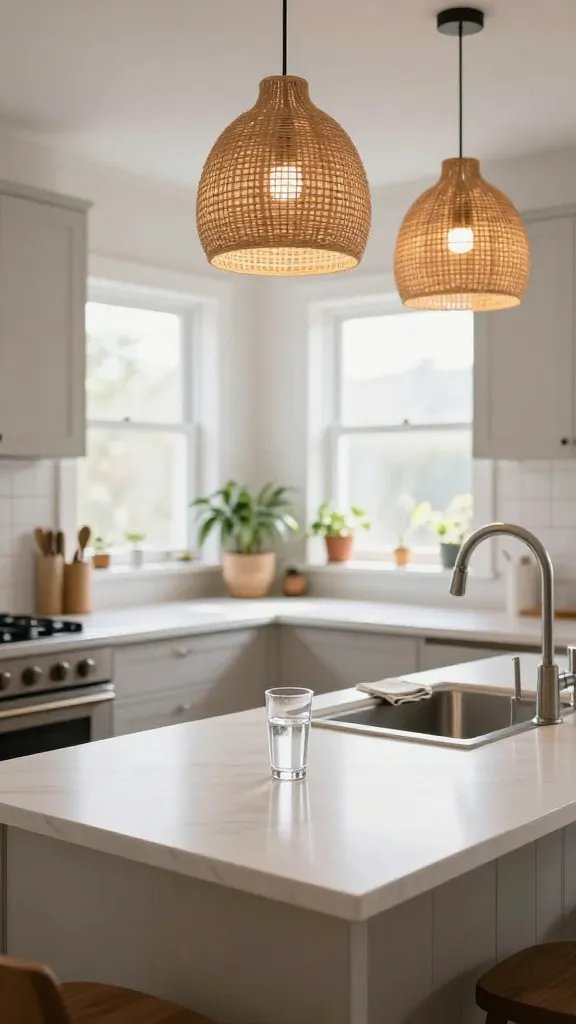
Lighting is the unsung hero of a kitchen. It sets the vibe and makes meal prep less of a strain on the eyes. Bad lighting turns a chef’s kiss into a shrug.
– Layer your lighting: ambient, task, and accent light. One ceiling fixture won’t cut it for detail work.
– Color temperature matters: warm light feels cozy for evenings; cooler light helps you spot stains and gauge doneness when you’re chopping or browning.
– Don’t chase perfection: practical lighting that helps you see what you’re doing beats a dramatic chandelier that casts weird shadows on your cutting board every time you dice onions.
If you’ve ever tilted your head while slicing garlic to catch a better glow, you know the power of good lighting. It’s not flashy; it’s essential.
Section 5: The Aesthetic Dilemma: Style vs. Everyday Living
The Aesthetic Dilemma: Style vs. Everyday Living
Design lovers often want a space that looks pristine all the time. Reality check: kitchens live in a tug-of-war between beauty and practicality. And that’s okay.
– Pick a unifying material for a cohesive look, then layer in texture with textiles and small decor accents. You want harmony, not a museum exhibit.
– Choose hardware that’s both pretty and practical: easy-to-grip pulls and durable finishes that don’t show fingerprints.
– Plan for durability: stains happen; scratches happen; your kitchen should forgive you and keep shining.
A kitchen that’s only Instagram-perfect will feel hollow after day three of using it. The goal is a space that feels intentional and forgiving, where you can mess up and still feel proud of the result.
Section 6: The Counter-Intuitive Move: Appliances to Retire (And Why)
The Counter-Intuitive Move: Appliances to Retire (And Why)
We all covet the shiny gadget that promises to do everything. Spoiler: most of us don’t need half of what we own. The real win is owning fewer, better tools that actually get used.
– Audit your appliance collection: which devices truly earn their keep? If you haven’t plugged in the slow cooker in six months, it’s time to rethink.
– Choose one all-in-one device where possible: a high-quality blender that doubles as a smoothie maker and a food processor can reduce clutter.
– Store seasonal-use items somewhere convenient yet out of sight when not in use to keep the countertops calm.
This isn’t about depriving yourself; it’s about freeing your counters from the clutter that makes cooking feel like a battle rather than a joy.
Section 7: The Micro-Missteps: Little Details That Add Up
The Micro-Missteps: Little Details That Add Up
Sometimes the smallest decisions have the biggest impact. Tiny missteps accumulate into a kitchen that feels off, even if it’s beautiful.
– The wrong sink size or placement can slow you down every day. If you’re constantly splashing water on the counter, you’re fighting your own design decisions.
– A soap dispenser that’s hard to reach is not cute; it’s frustrating. Make cleanliness effortless with accessible dispensers and well-placed towels.
– Trash and recycling should be easy to reach, not a logistics puzzle. If you’ve got to zigzag around the kitchen to deal with waste, you’ll delay cleanup and invite chaos.
Subsection — The Cutting Board Dilemma
A cutting board is more than a surface; it’s a culinary ally. Too awkward to reach or too slippery to stay in place will ruin your groove.
– Store boards near the prep zone and consider a silicone mat to keep things from sliding. A stable board makes knife work safer and more enjoyable.
– Have a dedicated, easy-to-clean board for raw proteins and another for vegetables. Cross-contamination is not a vibe.
FAQ: Quick Answers to Your Burning Kitchen Design Questions
FAQ
– What’s the single best layout tweak for most kitchens? Reposition the island or sink so the main work triangle is easily reachable from your primary prep zone. A small shift can cut walking time dramatically.
– How do I decide between open shelves and closed cabinetry? Open shelves look airy and show off your prettiest items, but they demand regular tidying. Closed cabinets reduce clutter but can hide useful items. Balance with a mix of both.
– What can I do today to improve pantry organization? Group items by category, use clear containers, label everything, and rotate stock so you use what you have before it goes stale.
– Is it worth upgrading lighting before appliances? Yes. Good lighting changes how you perceive the space, and it makes cooking safer and more enjoyable, especially for detail work.
Conclusion: Your Kitchen, Your Rules, Your Joy
Conclusion
You don’t need a perfect kitchen to be happy in it. You need a space that serves you—meals, memories, and a splash of joy—without fighting you every step of the way.
If you’re feeling overwhelmed by the “shoulds” of design, take a breath. Start with the basics: layout that supports your flow, storage that actually makes sense, a counter plan that keeps things handy, lighting that helps you see clearly, and a tone that fits your life. Then let your personality creep in through hardware, textures, and small touches that make the space yours.
Remember, kitchen design isn’t a single moment of wow; it’s a living, breathing space you inhabit daily. It should be beautiful, yes, but more importantly, it should feel right when you’re in the middle of a 6 p.m. rush and your fridge light flickers at just the right mood.
If you can deliver that, you’ve won the day—and you’ll probably cook more at home, which is the ultimate win.