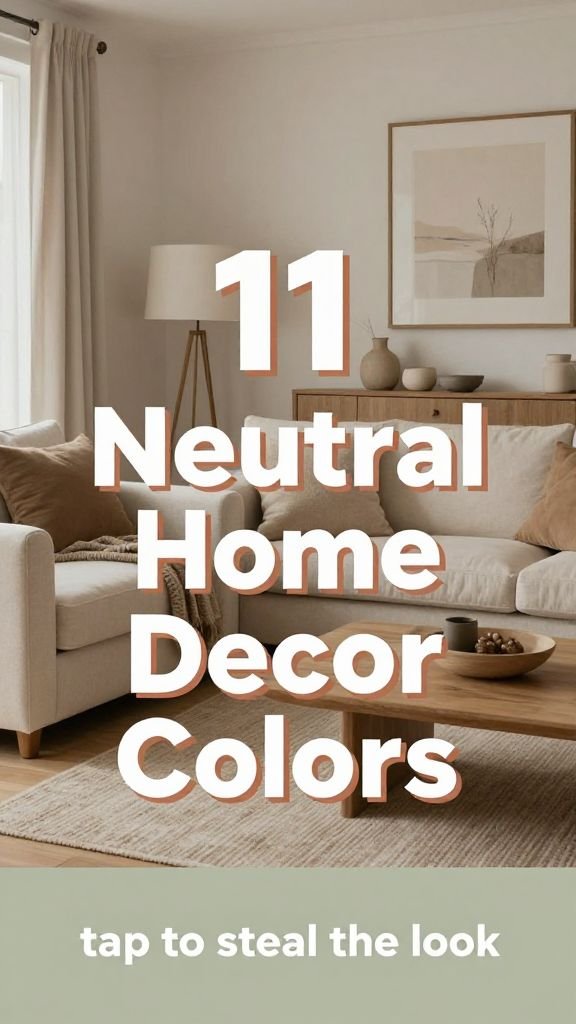
Tired of seeing the same washed-out beige and baby pink everywhere? Neutral doesn’t have to mean boring or safe. These sophisticated color combinations prove that you can keep things calm and grounded while still having a room with actual personality and depth.
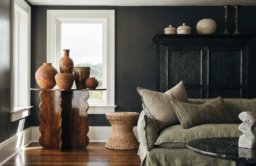
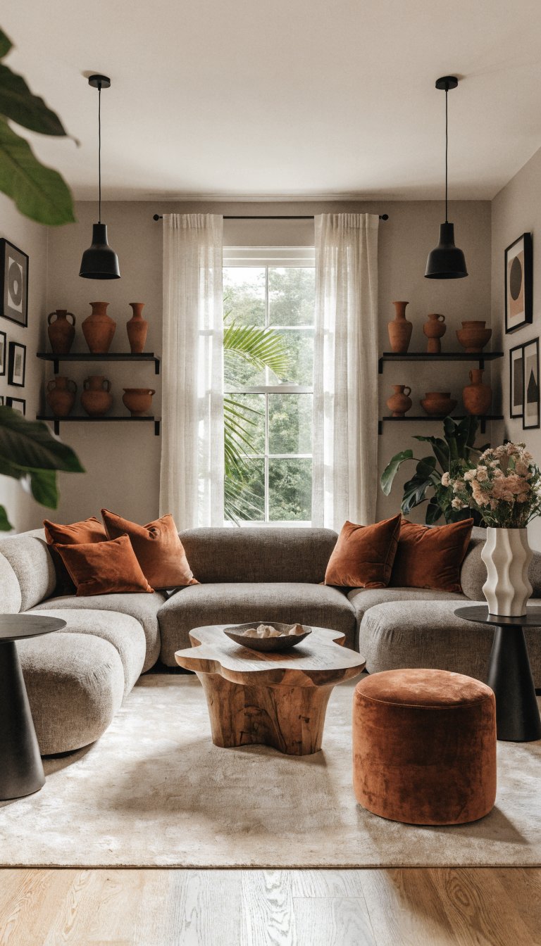
1. Warm Terracotta and Clay With Deep Charcoal
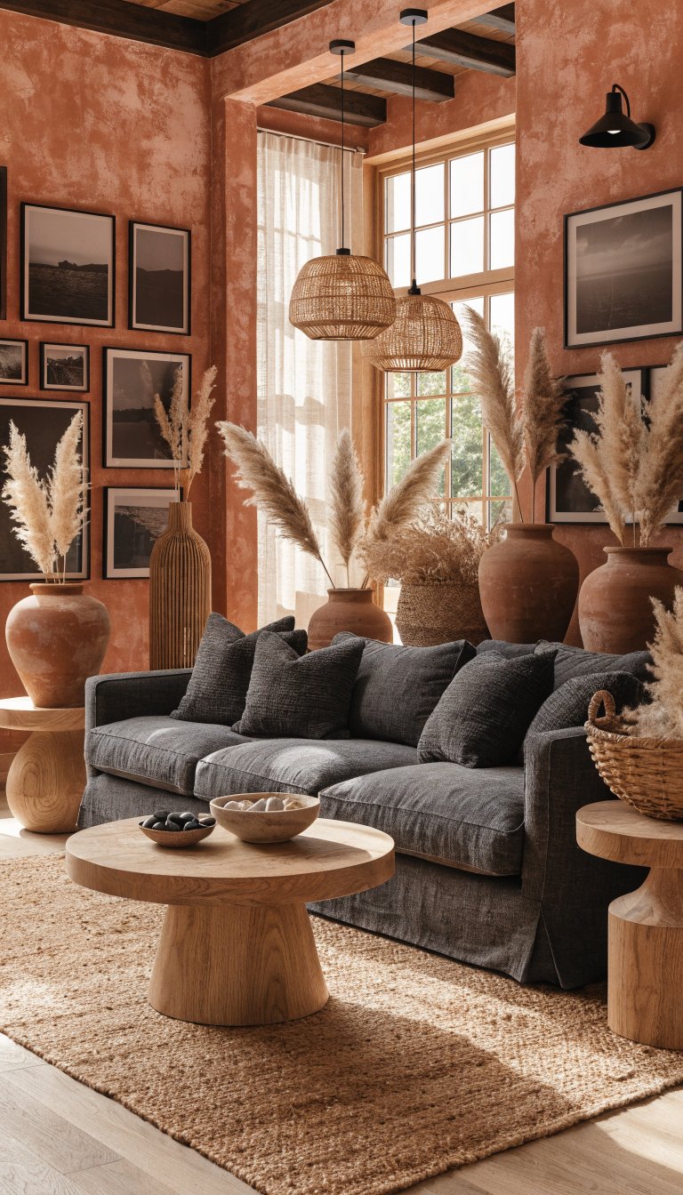
This earthy combination brings desert vibes without feeling like a Southwest cliché. The richness of terracotta paired with charcoal gray creates serious depth while staying completely neutral.
Picture clay-colored walls anchored by a charcoal linen sofa and natural oak furniture. Add in terracotta ceramic vases, a handwoven jute rug, and black matte picture frames to tie it all together. The warmth comes from the clay tones, while the charcoal keeps everything grounded and sophisticated.
Key Elements:
- Terracotta accent wall or large ceramic planters
- Charcoal upholstered furniture with natural wood legs
- Warm brass or black metal light fixtures
- Layered neutral textiles in cream and rust
This palette works beautifully in living rooms or dining spaces where you want warmth without going full-on cozy cottage. It’s grounded, mature, and has just enough edge to feel current.
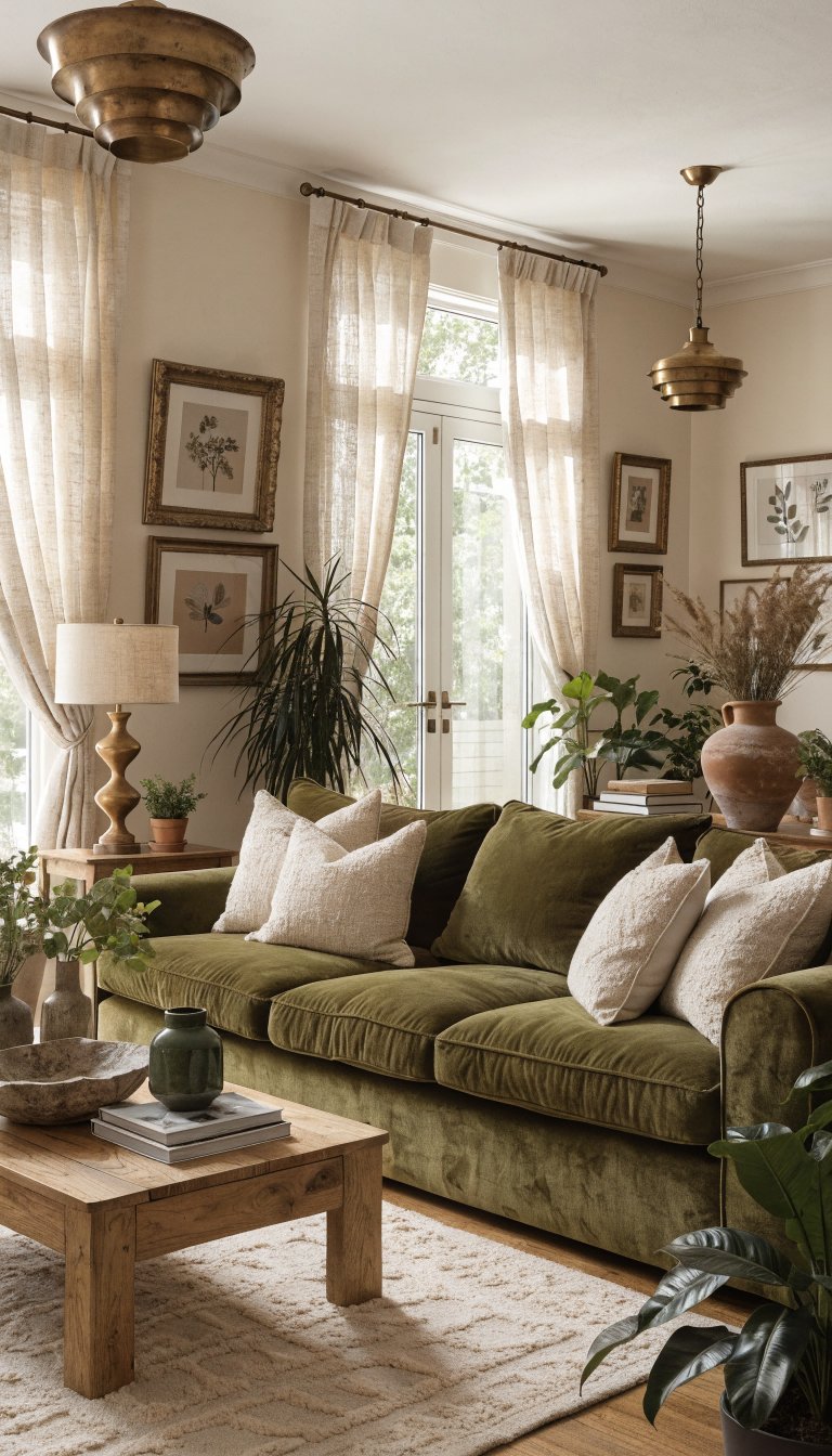
2. Sage Green With Warm Taupe and Cream
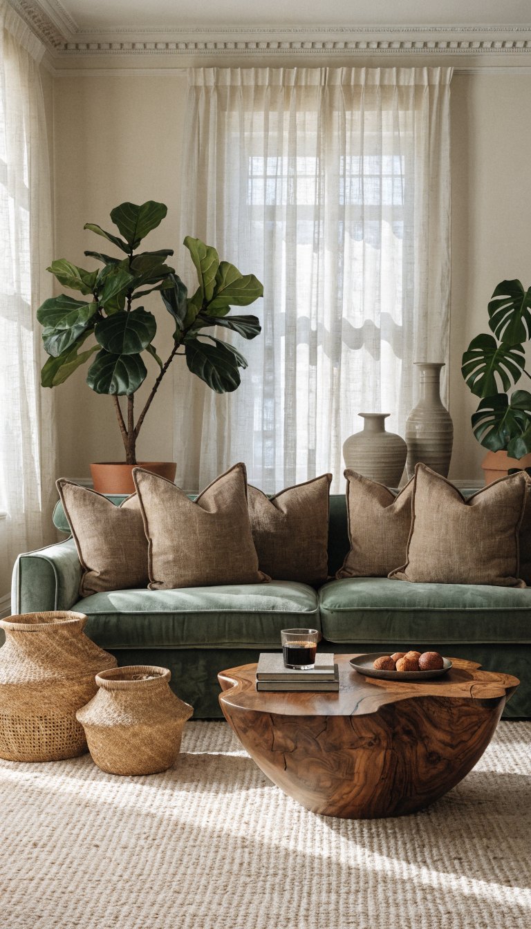
Forget mint and seafoam—we’re talking about the sophisticated older sibling of green neutrals here. Dusty sage paired with warm taupe creates a calming, organic feel that’s worlds away from pastel territory.
Start with sage green cabinetry or an upholstered headboard as your anchor. Layer in taupe linen bedding or throw pillows, and add cream-colored walls to keep things light. Bring in natural materials like rattan baskets, wood accents, and plenty of greenery to emphasize the organic vibe.
The magic happens when you add texture through chunky knit throws, linen curtains, and matte ceramic accessories. These tactile elements prevent the space from feeling flat despite the muted palette.
Perfect for bedrooms or home offices where you want to feel calm and focused. This combination has major “I have my life together” energy without trying too hard.
3. Chocolate Brown With Ivory and Black Accents
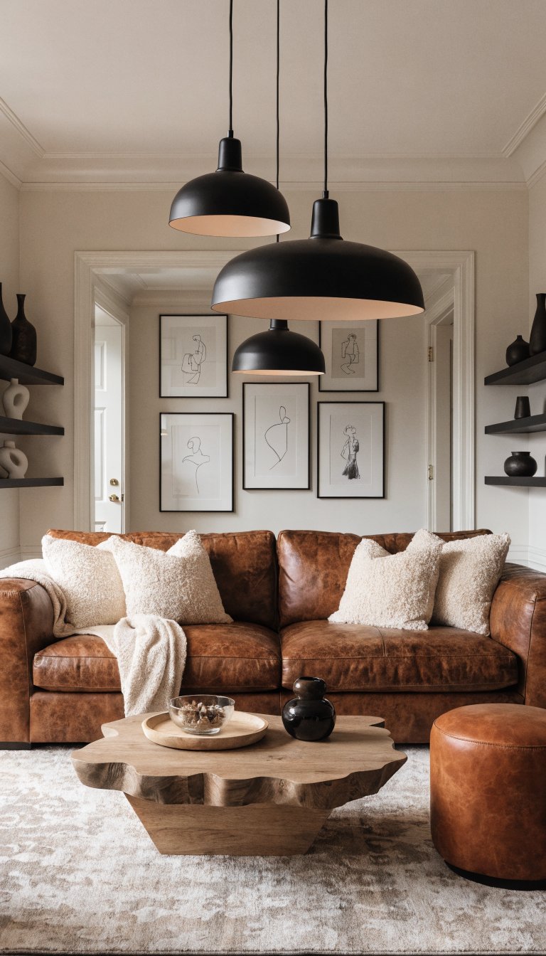
Brown is having a major moment, and this isn’t your grandma’s dated wood paneling. We’re talking rich, luxurious chocolate brown that feels like the ultimate comfort color.
A chocolate brown leather sofa or velvet armchair becomes the star against ivory walls. Add black metal shelving, black picture frames, and black pendant lights for contrast that pops. Warm it up with cognac leather accessories, wood coffee tables, and cream bouclé throw pillows.
Styling Details:
- Layer different shades of brown (chocolate, camel, cognac)
- Mix textures like leather, velvet, and wool
- Use black sparingly as graphic punctuation
- Add warmth with brass or gold hardware
This palette screams sophistication and works especially well in spaces where you entertain. It’s masculine without being a bachelor pad, warm without being overly cozy.
4. Soft Gray With Warm Mushroom and White Oak
Here’s how to do gray without your space feeling like a sad office building. The trick? Pair cool soft gray with earthy mushroom tones and the warmth of white oak wood.
Think gray upholstered dining chairs around a white oak dining table, with mushroom-colored walls creating the perfect backdrop. Add gray-toned artwork, ceramic table lamps in soft taupe, and white oak floating shelves. The wood tones are crucial—they inject life into what could otherwise feel cold.
Layer in cream textiles, natural fiber rugs, and plenty of organic textures. Trust me, the mushroom undertones are what make this feel current instead of that cold gray everyone did in 2015.
Ideal for minimalists who want their space to feel serene but not sterile. This works beautifully in kitchens, dining rooms, or any space where you want that Scandinavian-inspired calm.
5. Navy Blue With Camel and Crisp White
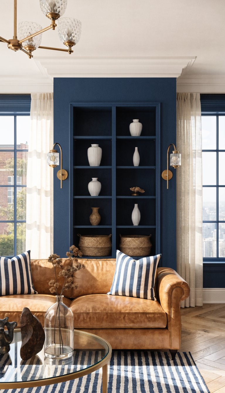
Navy is technically a neutral when you use it right, and this combination proves it. Deep navy brings drama, camel leather adds warmth, and crisp white keeps everything feeling fresh.
A navy accent wall or navy built-in shelving creates instant sophistication. Pair it with a camel leather sofa, white oak floors, and crisp white trim. Add brass hardware and light fixtures to bridge the warm and cool tones. Layer in navy and white striped textiles, natural woven baskets, and ceramic accessories in cream.
Color Balance:
- Use navy on one major element (walls, large furniture, or cabinetry)
- Let camel be your warm middle ground
- Use white generously to keep things bright
- Add natural wood tones throughout
This palette feels classic and timeless—like it could work in a beach house or a city apartment equally well. It’s preppy without being precious, sophisticated without being stuffy.
6. Greige With Rust and Matte Black
Greige gets a bad rap for being boring, but hear me out. When you punch it up with rust orange accents and matte black details, it becomes the perfect neutral backdrop for something actually interesting.
Start with greige walls and a greige sectional. Now add the good stuff: rust-colored throw pillows, a rust velvet ottoman, and terracotta pottery. Bring in matte black picture frames, black metal side tables, and black pendant lights for edge. Layer natural wood elements and a cream area rug to soften everything.
The rust is what saves this from being another boring greige room. It adds just enough color to feel intentional without screaming “accent color.” The black keeps it from feeling too soft or feminine.
This works everywhere but shines in modern living rooms or bedrooms where you want sophistication with a pulse.
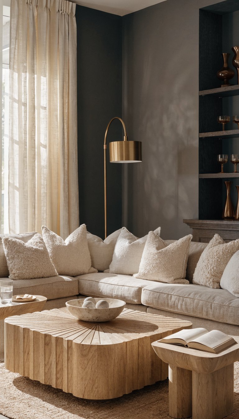
7. Warm White With Honey Wood and Soft Black
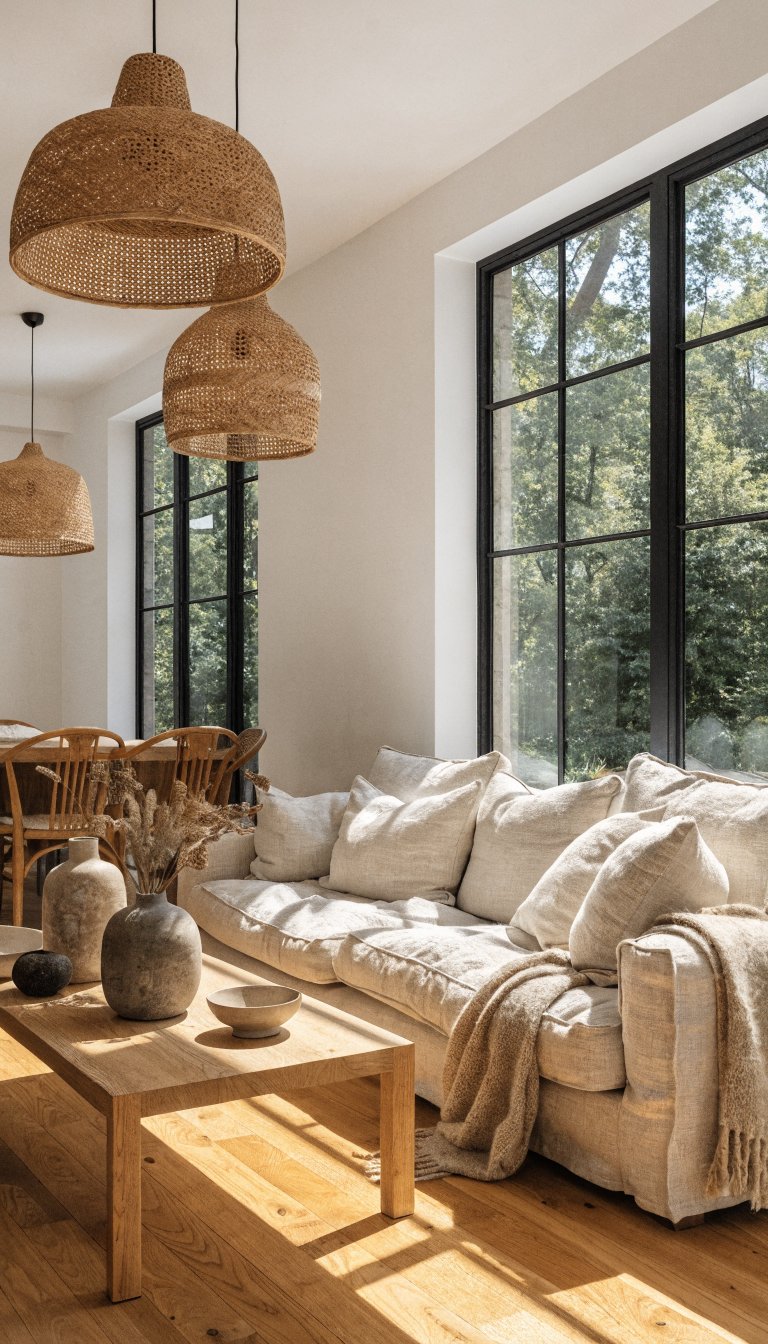
This is minimalism done right—warm, inviting, and actually livable. Warm white walls meet honey-toned wood and soft black accents for a look that’s clean but never cold.
Picture white walls with warm undertones (no stark white here), honey oak flooring or furniture, and soft black window frames or light fixtures. Add a cream linen sofa, natural woven pendant lights, and wood dining chairs. Keep accessories minimal but warm—ceramic vases, wood bowls, and natural fiber textiles.
The Key to This Look:
- Choose warm whites (not cool or stark)
- Use honey or light oak woods (not too dark or orange)
- Keep black soft and matte (not glossy or heavy)
- Layer organic textures throughout
Perfect for anyone who loves that Japanese-Scandinavian hybrid aesthetic. It’s peaceful, uncluttered, and effortlessly chic. FYI, this is also the easiest palette to maintain if you’re not big on constant redecorating.
8. Dusty Blue With Warm Gray and Natural Linen
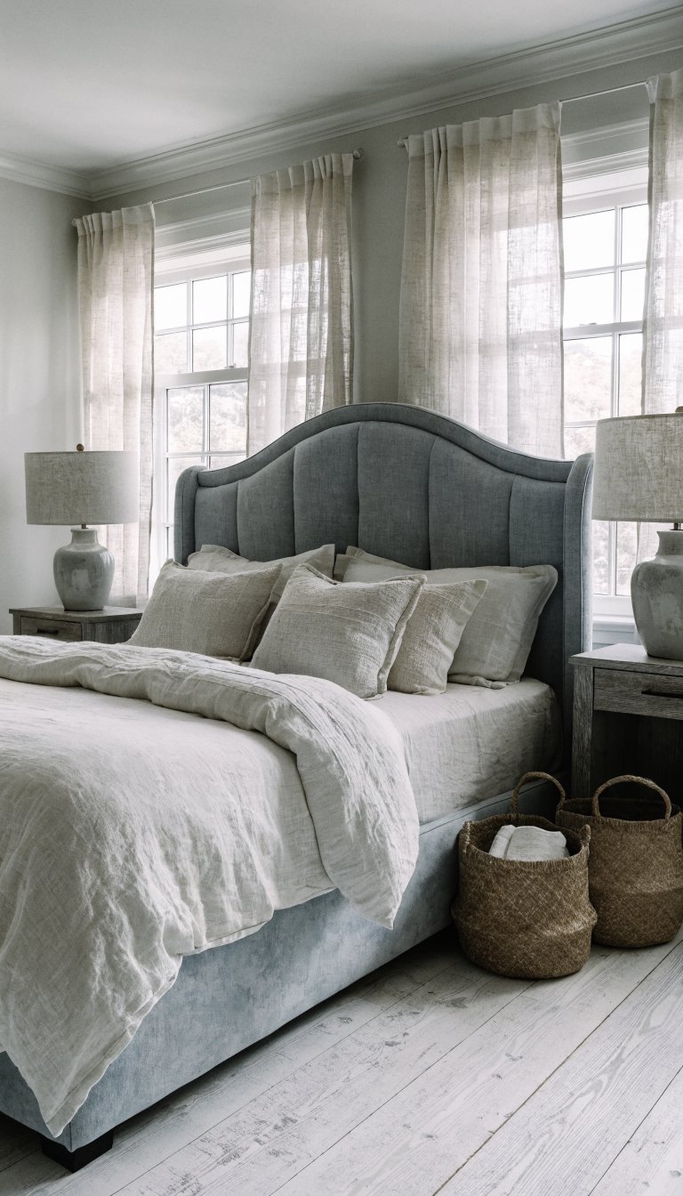
Dusty blue walks the line between neutral and color perfectly. Paired with warm gray and natural linen, it creates a coastal-inspired look that doesn’t require a single seashell or anchor.
Try dusty blue kitchen cabinetry with warm gray countertops and natural linen curtains. Or go for a dusty blue upholstered bed with gray nightstands and linen bedding. Add whitewashed wood, woven baskets, and ceramic lamps in soft gray. The trick is keeping everything slightly muted—no bright navy or royal blue here.
Layer different textures in similar tones: linen pillows, cotton throws, wool rugs, and natural fiber art. The monochromatic layering creates depth despite the quiet palette.
This feels fresh and airy, perfect for bedrooms, bathrooms, or kitchens where you want calm sophistication. It’s like if the beach had better taste.
9. Olive Green With Cream and Aged Brass
Olive is the cool, understated cousin of emerald and sage. Muted olive green paired with cream and aged brass creates an organic, lived-in look that feels effortlessly elegant.
Start with olive green walls or a large olive velvet sofa. Layer in cream-colored textiles—think linen curtains, cream throw pillows, and a cream area rug. The brass comes in through light fixtures, hardware, picture frames, and decorative objects. Add natural wood furniture and plenty of greenery to emphasize the organic vibe.
Must-Have Elements:
- Olive as your dominant color (walls or large furniture)
- Cream in soft, natural fabrics
- Aged or antique brass (not shiny gold)
- Warm wood tones in medium to dark shades
This palette has major “European countryside villa” energy. It works beautifully in dining rooms, living rooms, or bedrooms where you want something earthy but refined.
10. Charcoal With Warm Beige and Natural Wood
Dark walls don’t have to feel dramatic or moody. Charcoal gray paired with warm beige and natural wood creates a cocooning effect that’s sophisticated and grounding.
Paint one wall or an entire room in charcoal gray, then balance it with a warm beige sofa or bedding. Bring in light wood furniture—think white oak or ash—to prevent the space from feeling too dark. Add cream curtains, natural fiber rugs, and warm metal accents in brass or copper.
The contrast between the dark charcoal and light natural elements creates visual interest without needing bold colors. Layer in textured throws, linen pillows, and ceramic accessories in neutral tones.
Seriously perfect for creating intimate, sophisticated spaces. This works especially well in bedrooms, home offices, or reading nooks where you want to feel wrapped in comfort.
11. Stone Gray With Warm Putty and Black Walnut
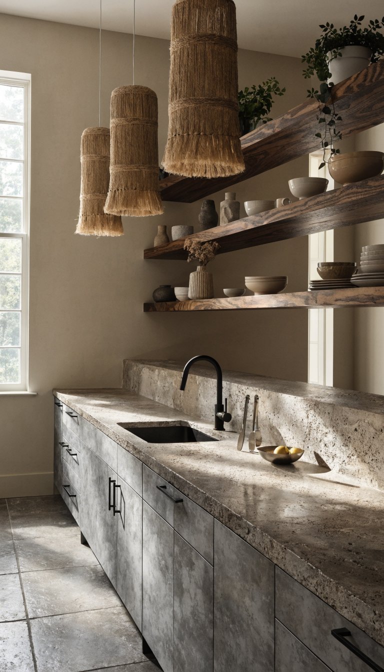
This is the most architectural of all these palettes. Stone gray brings cool sophistication, warm putty softens it, and black walnut wood adds rich depth and luxury.
Think stone gray kitchen cabinets with black walnut open shelving and warm putty walls. Or a stone gray upholstered headboard with black walnut nightstands and putty-colored bedding. Add stone or concrete accessories, matte black hardware, and natural fiber textiles. The key is balancing the cool grays with enough warm elements to prevent it from feeling industrial.
Balancing Act:
- Use stone gray as your foundation
- Let warm putty cover large surface areas (walls, bedding)
- Feature black walnut as statement pieces
- Add warmth with brass, leather, or warm textiles
This palette feels modern, clean, and expensive—like something from an architecture magazine. It’s perfect for kitchens, bathrooms, or any space where you want that high-end minimalist vibe.
There you have it—proof that neutral palettes can have serious personality without a pastel in sight. Mix your textures, layer your tones, and don’t be afraid to go deeper and richer than you think. Your space will thank you for it.