Spring’s here, and suddenly your living room looks as dull as that half-dead houseplant you keep promising to water. Time for a refresh, right? But before you panic-buy every pastel throw pillow in sight, let’s talk about adding color without turning your space into a chaotic mess. Because nobody wants their living room to look like a toddler’s finger-painting experiment.
Start Small (But Make It Count)
Diving headfirst into a rainbow explosion is tempting, but restraint is your friend. Instead of repainting the whole room neon yellow, try these subtle yet impactful moves:
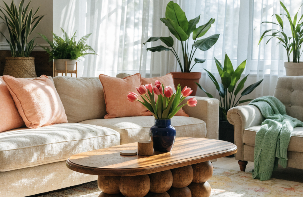
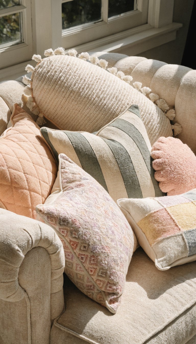
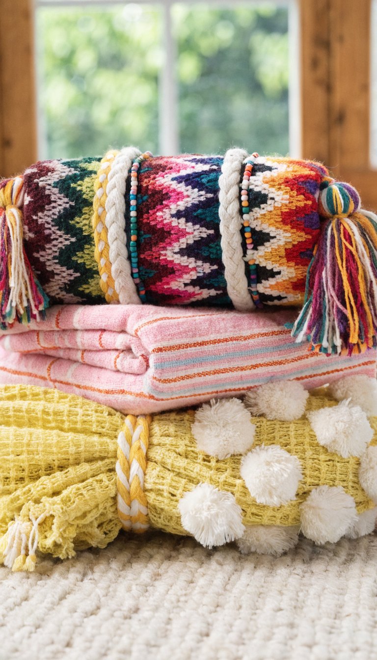
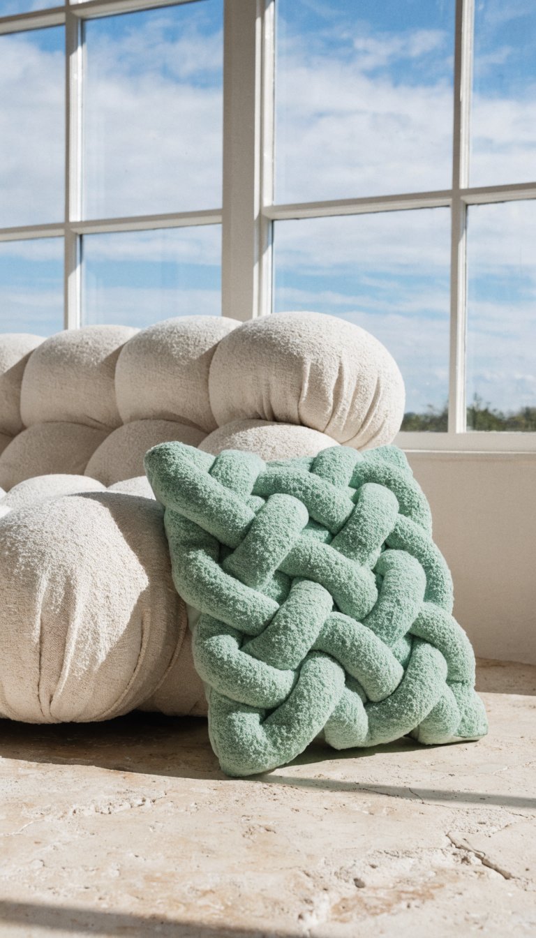
- Throw pillows that pop: Swap out neutral cushions for ones in spring hues like soft peach, mint, or buttery yellow. Two or three colorful ones mixed with neutrals keep things balanced.
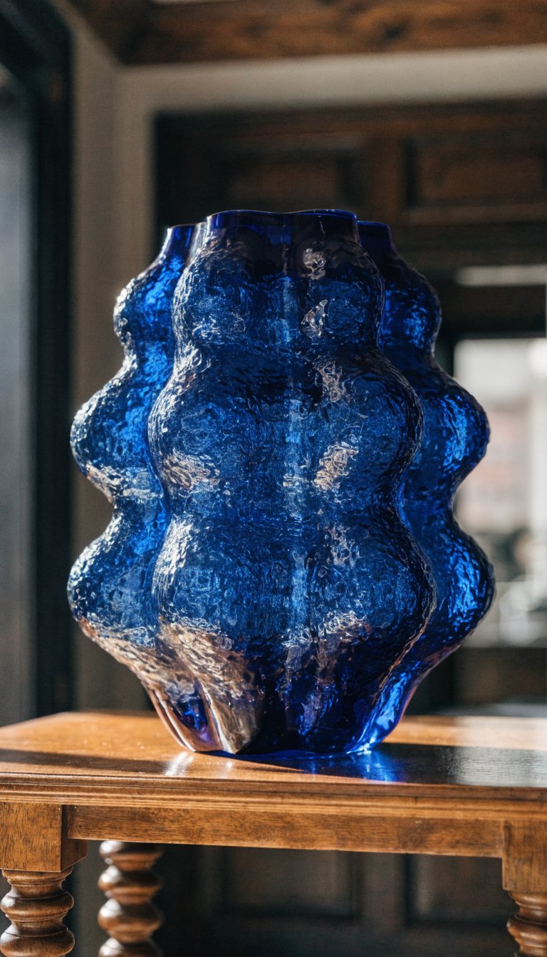
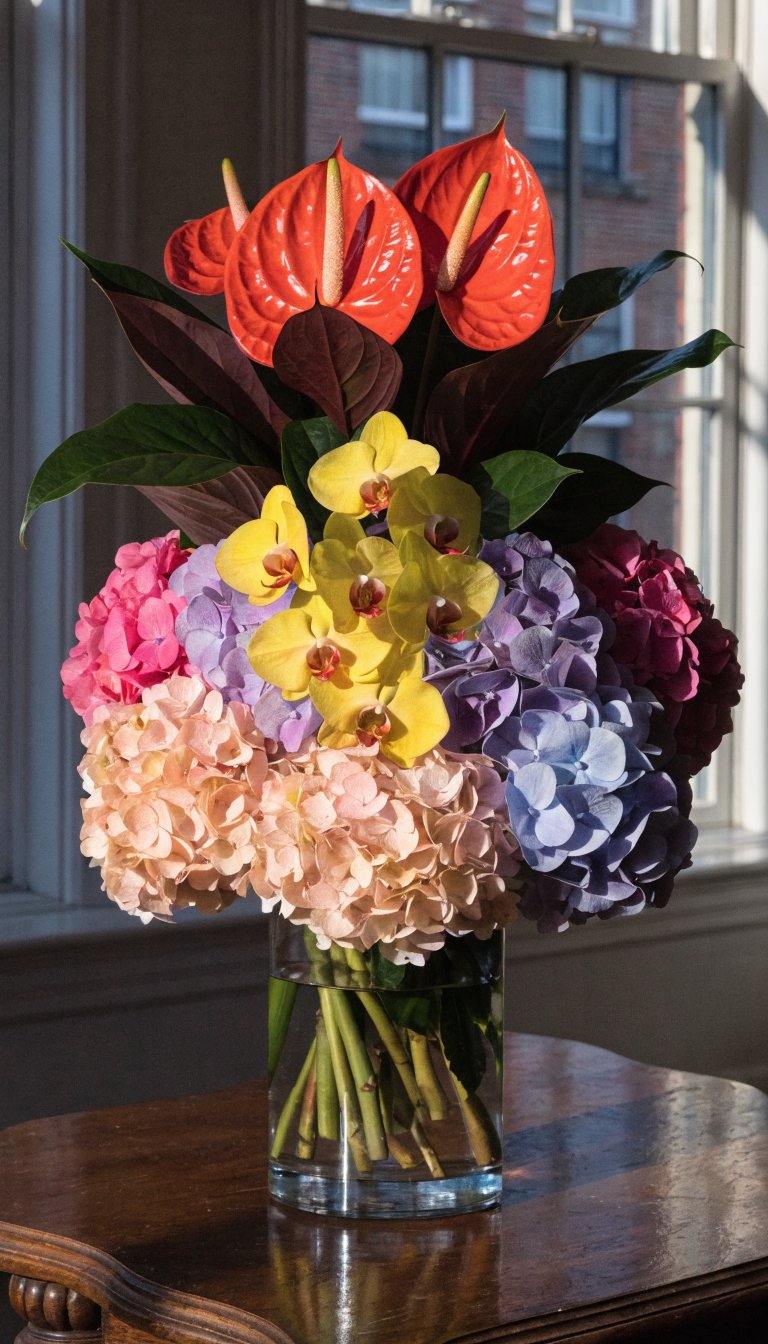
- A statement vase: One bold ceramic or glass piece in a vibrant shade (cobalt blue, anyone?) adds instant energy without overwhelming.
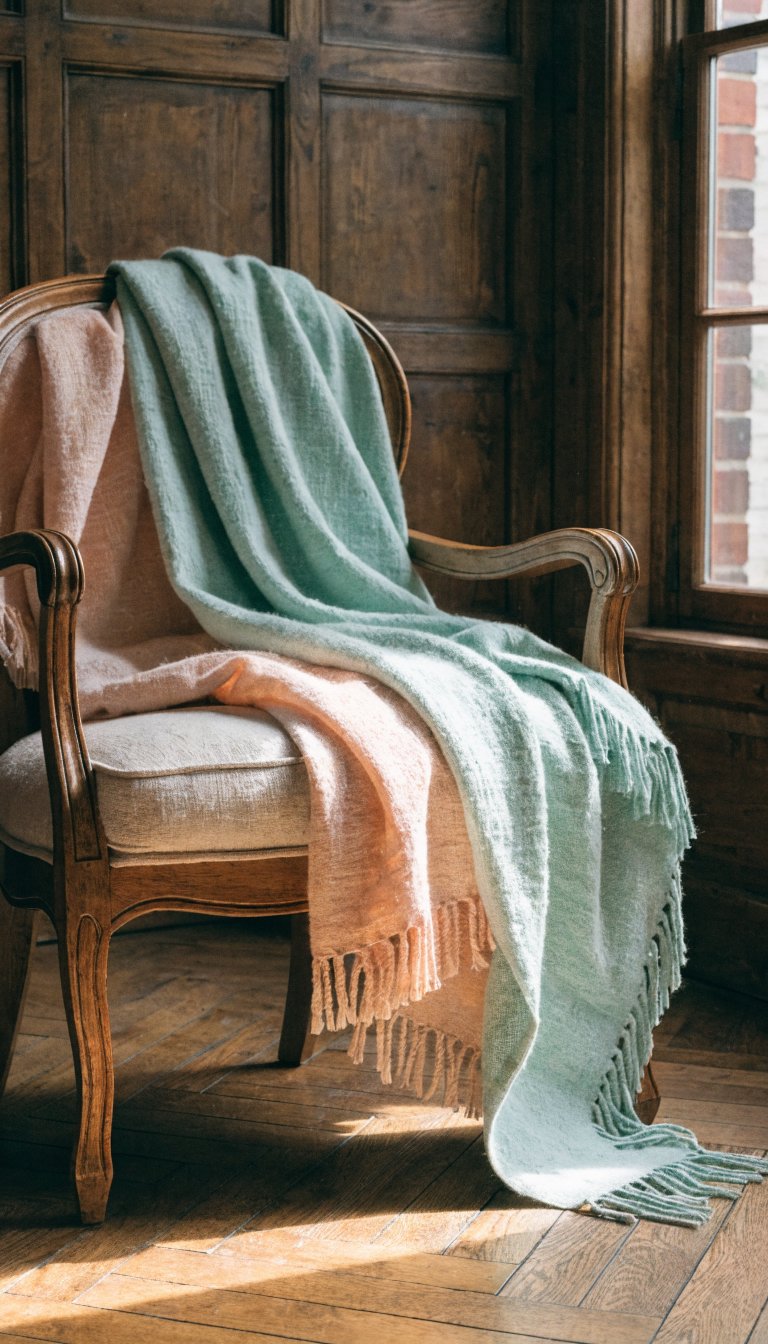
- Textiles with personality: A patterned rug or a lightweight throw in a fresh color can redefine the space. Pro tip: Stick to one “hero” textile to avoid visual noise.
Why This Works
Small pops of color let you test-drive shades without commitment. If you hate that coral pillow in two weeks? No big deal—swap it. It’s like dating colors before marrying them.
Embrace Nature’s Color Palette
Spring’s greatest gift? Free inspo from outside your window. Pull in organic hues that already feel harmonious:
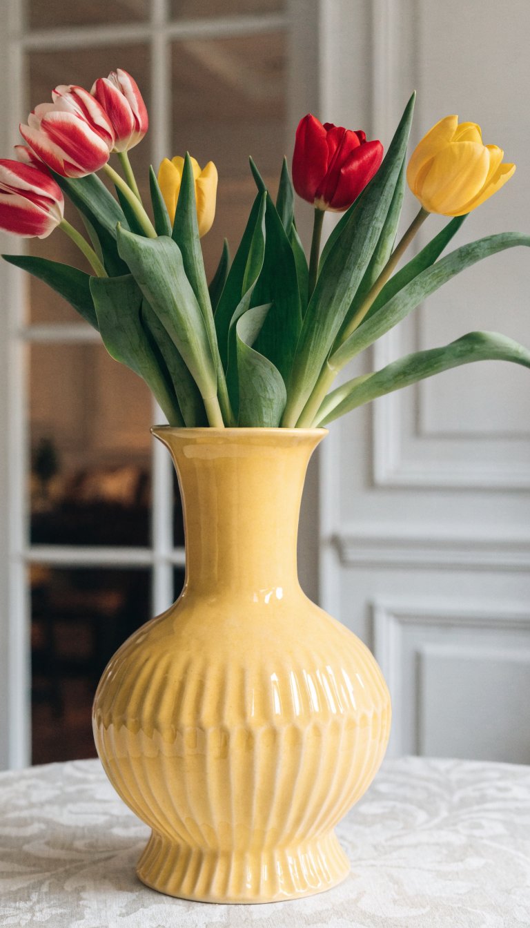
- Greenery galore: Plants = instant life. A fiddle-leaf fig or a bunch of eucalyptus in a simple vase adds freshness and color.
- Wood tones: Warm up cool colors with natural wood accents (think side tables or bowls). It grounds brighter shades so they don’t feel floaty.
- Floral nods: Not into literal flowers? Try art, fabrics, or even wallpaper with botanical prints. Just keep the scale balanced—tiny prints can look busy.
Pick a Color Story (Not a Novel)
Randomly tossing in every Pantone shade of the year? Hard pass. Instead, choose a loose “story” to guide your palette:
- Sunrise vibes: Soft pinks, peaches, and pale yellows (like that golden-hour glow).
- Ocean-inspired: Blues and greens with sandy neutrals to mellow them out.
- Earthy brights: Mustard, terracotta, and sage—warm but not overwhelming.
Limit yourself to 2-3 main colors plus neutrals. This isn’t a crayon box—it’s a curated collection.
Avoiding the Rainbow Effect
If your room starts looking like a Lisa Frank notebook, dial it back. Repeat colors in different spots (e.g., that peach pillow echoes the art frame) to create rhythm, not chaos.
Play With Texture to Add Depth
Color isn’t just about hue—it’s about how surfaces interact. Mix textures to keep things interesting:
- A chunky knit throw in cream softens a bold turquoise sofa.
- Glossy ceramic lamps next to matte-finish pillows add subtle contrast.
- Rattan or woven baskets bring warmth to cooler tones.
Texture keeps colorful spaces from feeling flat or childish.
Let Your Walls Breathe
If you’re craving color but fear clutter, keep walls light and let furniture/accessories do the work. White or soft gray walls act like a canvas, making your colorful pieces stand out without competing.
Or, if you’re feeling adventurous, try a single accent wall in a muted tone (dusty rose, pale blue) instead of going full saturation. It’s like dipping your toes in instead of cannonballing into the color pool.
FAQ: Your Spring Color Questions, Answered
Can I mix patterns AND bright colors without chaos?
Yes, but follow the “one loud, one quiet” rule. Pair a bold floral pillow with a striped throw in similar hues, not competing ones. Scale matters too—mix large and small prints.
What if I rent and can’t paint?
No worries! Removable wallpaper, colorful curtains, and big art pieces add pigment without permanent damage. Command Strips are your BFF.
How do I know if a color “goes” with my existing stuff?
Hold swatches (paint chips, fabric samples) next to your couch/rug at different times of day. Lighting changes everything. Or, use a color wheel—analogous colors (next to each other) always play nice.
Are there any colors to avoid in a small living room?
Dark, intense shades can feel closing in, but if you love them, use them sparingly (one accent chair, not the whole sectional). IMO, it’s more about balance than hard rules.
Help—I added color and now my room feels messy!
Edit, edit, edit. Remove one or two items and see if it feels calmer. Sometimes less really is more (said no maximalist ever, but still).
Wrap-Up: Color Without the Clutter
Spring’s the perfect time to refresh your space, but you don’t need to go full unicorn mode to make an impact. Start small, borrow from nature, and keep your palette cohesive. Remember: Color should make your room feel alive, not like it’s yelling at you. Now go forth and accessorize—responsibly.