Spring Color Palette Ideas for a Cozy Cottage Living Room
A cozy cottage living room deserves color that hugs you back. Think sunlight plus a warm blanket, with a dash of whimsy. Today we’re diving into spring color palettes that brighten space without shouting. Ready to makeover your living room with mood-changing hues? Let’s do this.
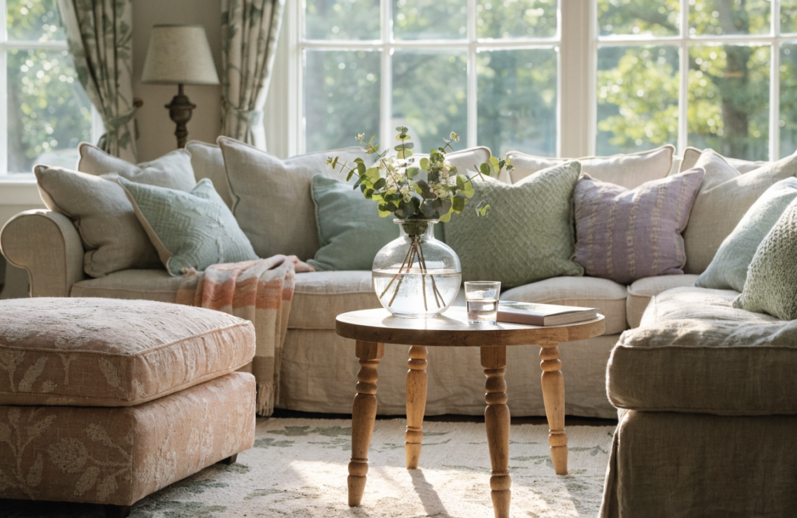
Soft Neutrals with a Whisper of Bloom
A spring breeze should feel gentle, not loud. Start with soft neutrals that lay a sunny base and let accent colors pop. Think warm beiges, creamy whites, and delicate greiges that read clean and calm.
– Walls: pick a warm, low-commitment shade like ivory or eggshell.
– Upholstery: opt for oatmeal or linen textures to keep the vibe airy.
– Accents: add a few pastel cushions or a striped throw to wake things up.
Why it works
Neutrals give your space a breathable backdrop so brighter spring colors can shine without clashing. They also make rooms feel larger and more inviting.
Where to add a pop
– A single floral ottoman in blush or sage
– A botanical print curtain or rug
– A vase of fresh greens on the coffee table
Pastel Palette Punch
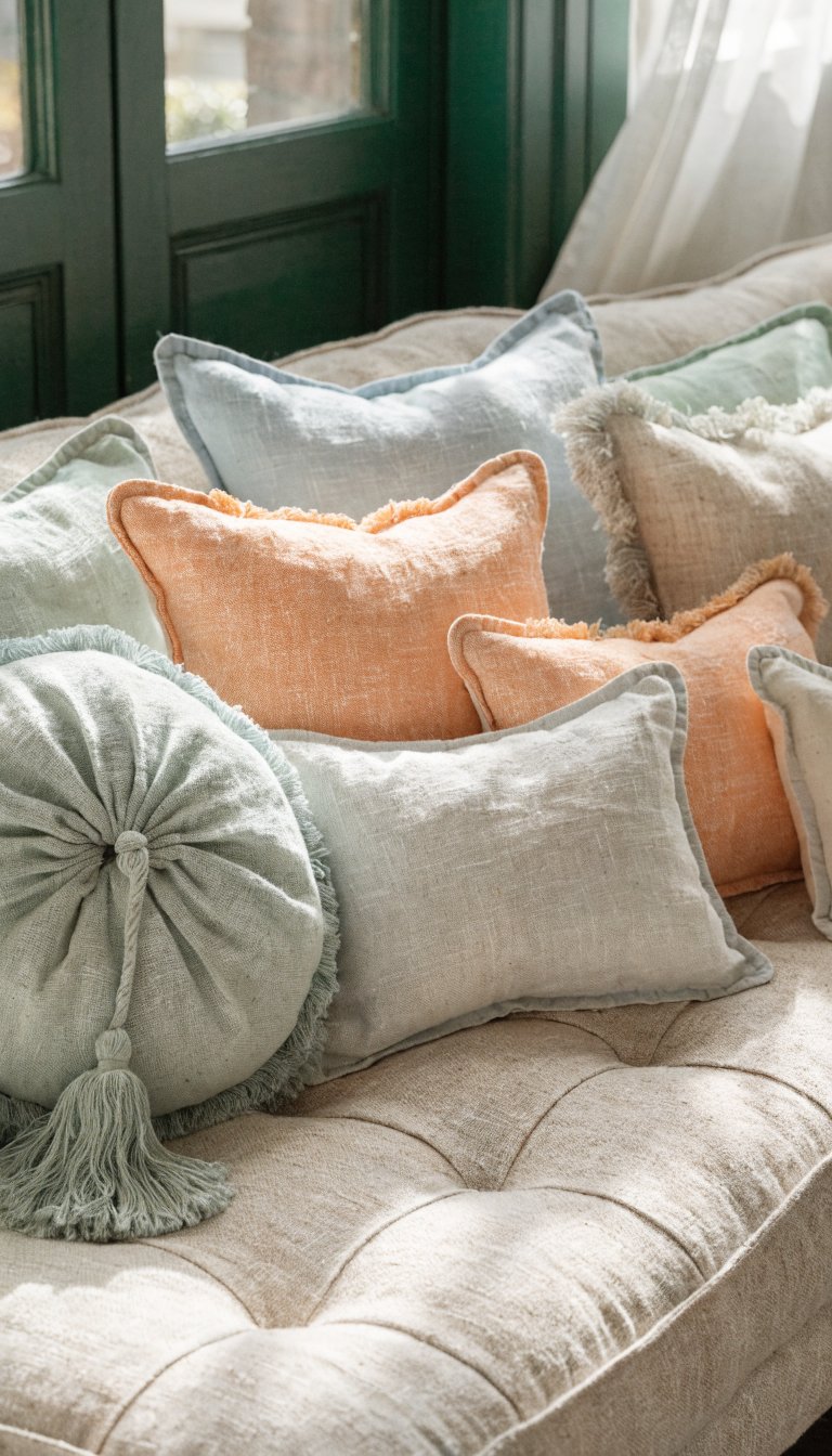
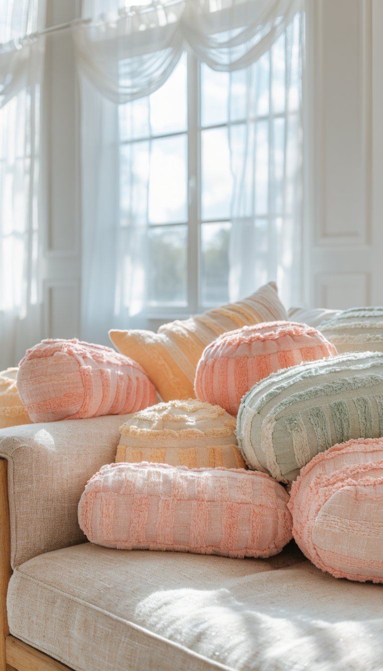
Pastels are the classic spring storytellers. They whisper, then shout when you want them to. Blend mint, lavender, blush, and pale blue for a cheerful, cottagey score.
– Use a dominant pastel for walls or a large piece of furniture.
– Layer lighter and slightly richer tones for depth.
– Bring in white accents to keep it from feeling sugary.
How to balance intensity
Don’t drown in color—anchor the room with a neutral anchor piece, like a whitewashed coffee table or a jute rug. FYI, too many pastels in one room can feel cartoonish unless you mix textures.
Texture tricks
– Velvet cushions in soft lilac for a luxe touch
– Woven baskets in natural tones to ground the palette
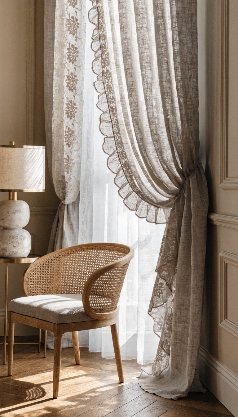
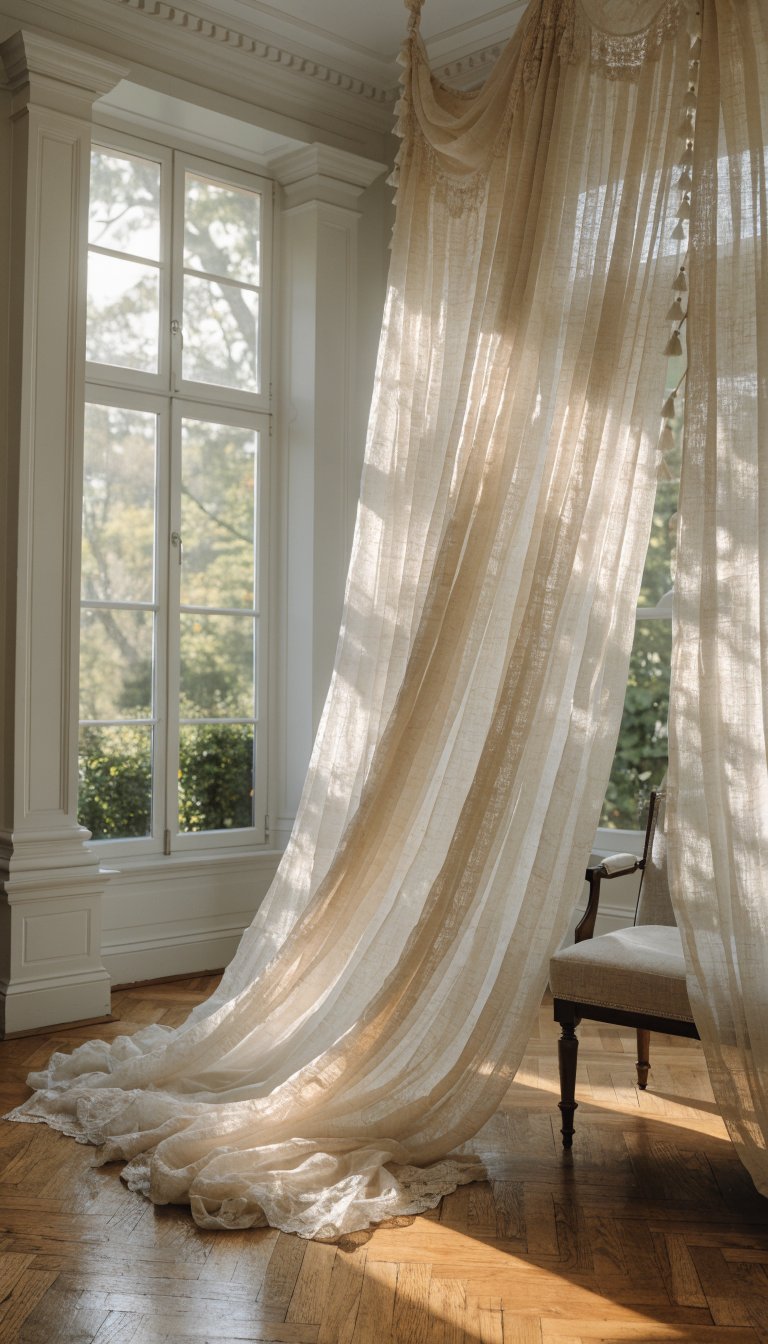
– Linen drapes that catch the breeze and soften edges
Greenery-First Calm
If nature is your muse, green is the language you want. From sage to olive to fern, greens bring calm and a sense of spring renewal.
– Walls: a soft sage or whisper green can be a surprising but delicious backdrop.
– Furniture: antique or painted wood pieces pair beautifully with green rooms.
– Accents: leafy patterns, terracotta pots, and natural textures.
Which greens to choose
– Sage: classic cottage, versatile with neutrals
– Olive: earthy, adds depth and warmth
– Mint: light, airy, perfect for spring brightness
Accent ideas
– A botanical print sofa blanket
– Ceramic planters in clay tones
– A green punch on your shelves, like jade fruit bowls
Sun-Kissed Yellows and Creams
Yellow is the mood-booster you didn’t know you needed. When paired with creamy whites or warm timber, it radiates sunshine without the glare.
– Walls: a buttery pale yellow can feel cozy rather than citrusy.
– Furniture: offset yellow with natural wood finishes.
– Textiles: add cream and taupe to keep it sophisticated.
Layering tips
– Use a large yellow lampshade for a soft glow
– Mix two or three yellows with different saturations to avoid monotony
– Keep the room balanced with cool-toned metal accents
Where to avoid overkill
Too much yellow can read kitchen-y or retro fast. If you’re worried, rely on a neutral wall and sprinkle yellow in textiles and decor instead.
Stone, Taupe, and a Hint of Lavender
If you want spring without shouting, a grounded palette with an unexpected lavender twist feels modern and cozy. Think stone grays, taupe, warm browns, and a whisper of lavender in accessories.
– Base: taupe walls or a light gray as the canvas
– Main furniture: mid-toned wood or black iron for contrast
– Lavender accents: small doses in pillows, throws, or decor pieces
Why lavender?
Lavender adds a subtle, cool undertone that complements spring greens and warm neutrals. It’s not too feminine; it’s grown-up and fresh.
Practical tips
– Keep lavender dosed in small doses to avoid overpowering the room
– Pair with brass or matte black hardware for a modern edge
– Use a soft, matte finish to enhance the cottage vibe
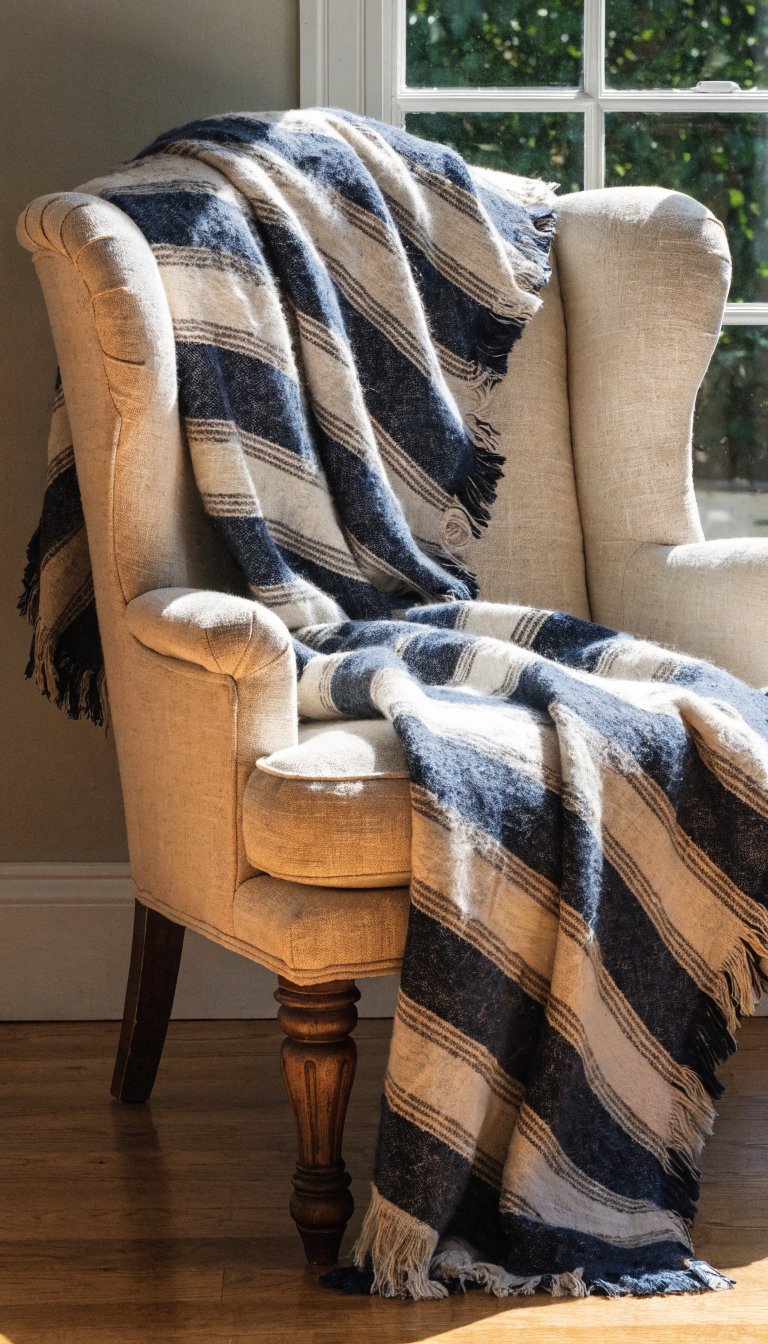
Seasonal Materials that Make the Color Sing
Color isn’t just about what you paint; it’s about what’s under and around it. Materials can amplify your palette without needing a repaint.
– Fabrics: choose cotton-linen blends for upholstery; they breathe and wrinkle less than pure linen.
– Wood: opt for light to medium woods like oak or ash; they brighten the room and play well with spring tones.
– Textures: mix knits, boucle, and woven jute to add depth.
How to mix textures
– Pair a soft velvet cushion with a rough-hewn wool throw
– Add a rattan or wicker basket to keep the cottage feel grounded
– Layer a linen curtain with a cotton-blend Roman shade for dimension
Lighting matters
Natural light is your best friend. Spring colors glow when the room isn’t darkened by heavy curtains. Use sheer drapes or light-filtering shades to let sunshine in and let colors bloom.
Practical Painter’s Guide: Small Rooms, Big Impact

If your living room is compact, you can still nail a spring palette without shrinking the space visually.
– Go lighter on walls, but bold on accents
– Use a larger rug in a neutral to expand the floor area
– Mirror placement: a well-placed mirror doubles the light and space
Color-testing tips
– Paint swatches on poster boards and move them around the room at different times of day
– Observe how colors change with sunlight and lamp light
– Pick a main color and two supporting hues, then let accents carry the rest
FAQ
What’s the easiest palette for a spring cottage vibe?
Start with soft neutrals as your base, then introduce a couple of pastel accents and a touch of greenery. It’s friendly, flexible, and forgiving if you want to change things later.
How do I keep the room cozy with brighter colors?
Balance bright colors with warm textures and materials—think a plush rug, knitted throws, and wood furniture. This keeps the space inviting rather than electric.
Can I mix metal finishes with these palettes?
Absolutely. A touch of brass, antique bronze, or matte black hardware adds character and keeps things from feeling flat.
What if I’m renting and can’t repaint?
Focus on color through textiles—cushions, curtains, throws, and rugs. You can still achieve a spring look with removable decor and artwork.
How do I incorporate plants without making the room feel busy?
Choose a few statement plants with clean lines and place them thoughtfully. A tall fiddle-leaf fig in a corner, a few succulents on a shelf, and a hanging planter by a sunny window create a fresh, breathable feel.
Conclusion
Spring color palettes for a cozy cottage living room aren’t about making a loud statement; they’re about crafting a mood you want to linger in. Start with a soft, comforting base, layer in gentle pastels or greens, and then sprinkle in a sunny or lavender twist for personality. FYI, the best rooms never scream for attention—they invite you to stay, sip tea, and pretend you’re in a country postcard. If you vibe with the idea of effortless charm and comfort, you’re already halfway there. Ready to test a new palette this weekend? Grab swatches, a coffee, and get painting (or at least swapping pillow covers).