You know that feeling when you walk into a room and your shoulders just drop? Not from disappointment, but from actual relaxation? That’s what neutral decor does when you get it right. Forget the idea that neutral means boring—we’re talking about creating a space that feels like a deep breath after a chaotic day. Let’s dive into how you can turn your home into a beautiful, serene sanctuary without sacrificing personality or style.
Why Neutrals Work for Creating Calm Spaces
Here’s the thing about neutral colors: they don’t compete for your attention. While that electric blue accent wall might look amazing on Pinterest, it’s basically screaming at you every time you try to relax on your couch. Neutrals give your brain a break.
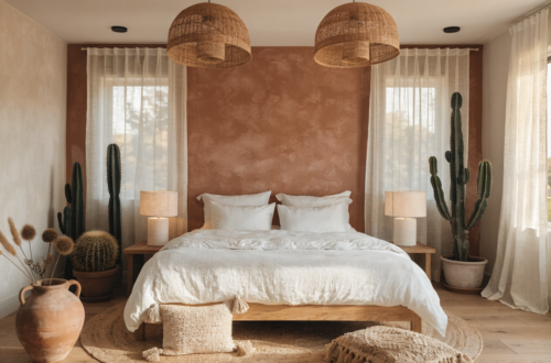
Think of neutrals as the background music of your home. They set the mood without demanding center stage. Beiges, whites, grays, and warm taupes create visual harmony that makes everything feel intentionally designed, even if you just threw it together last weekend.
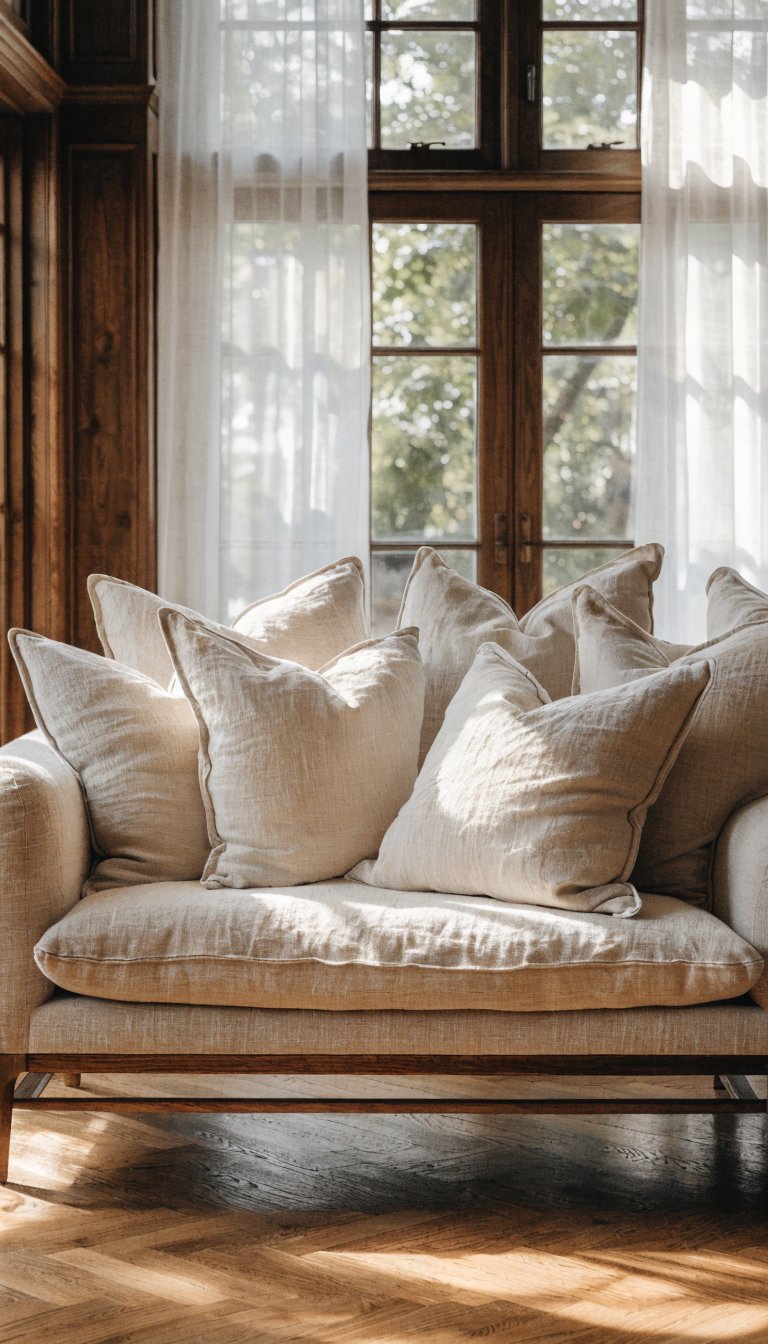
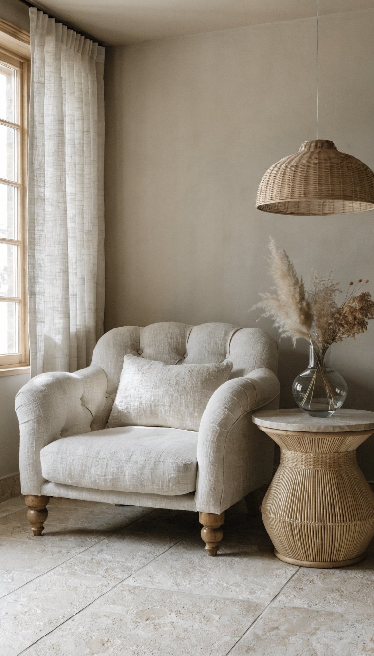
Plus, neutral doesn’t mean sterile or cold. The trick is layering different shades and textures to create depth. A cream sofa with taupe pillows, a gray throw blanket, and natural wood side table? That’s visual interest without the visual noise.
The Foundation: Choosing Your Neutral Color Palette
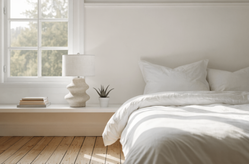
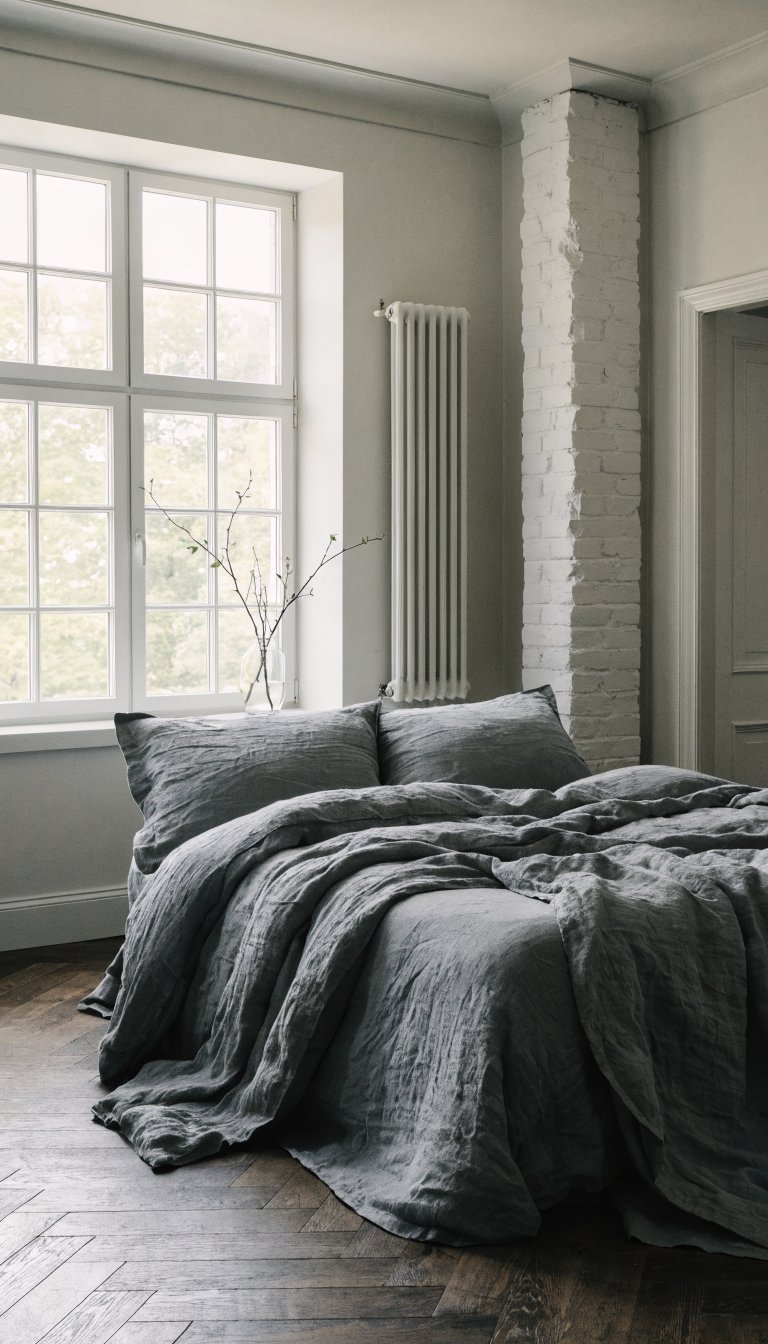
Before you start buying everything in sight, you need a game plan. Pick your primary neutral—this is the color that’ll dominate your space. Are you team warm (creams, beiges, warm grays) or team cool (pure whites, cool grays, soft blacks)?
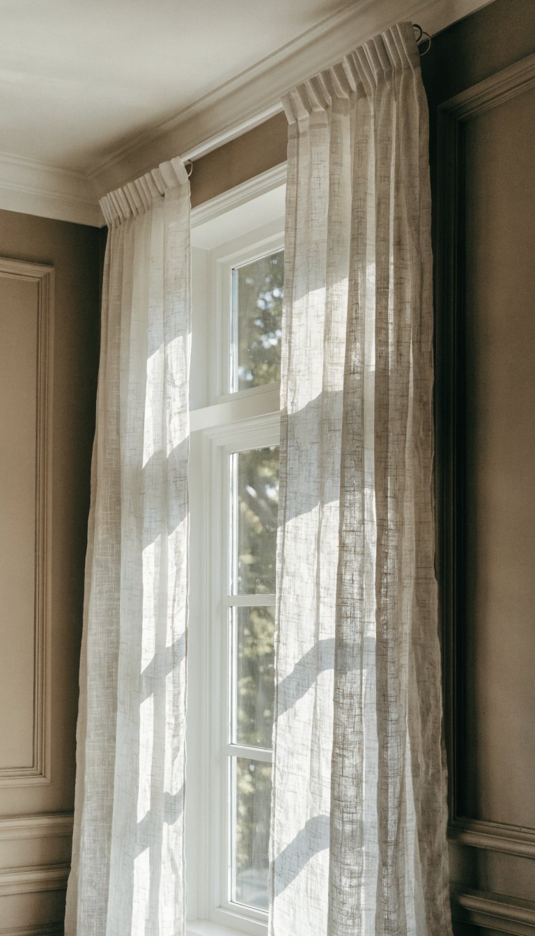
Warm neutrals create cozy, inviting spaces that feel like a hug. They work beautifully in living rooms, bedrooms, and any space where you want people to linger. Cool neutrals give you that crisp, clean aesthetic that photographs like a dream and feels super modern.
Once you’ve chosen your primary neutral, select 2-3 supporting shades. These should be slightly lighter or darker versions of your main color. This variation prevents your space from looking flat or one-dimensional. Trust me, monochrome can quickly turn into monotonous if you’re not careful.
The 60-30-10 Rule Still Applies
Even in neutral spaces, this classic design rule works wonders. Use your dominant neutral for about 60% of the room (walls, large furniture), your secondary neutral for 30% (smaller furniture, curtains), and save that final 10% for your darkest or lightest shade as an accent.
Texture Is Your Secret Weapon
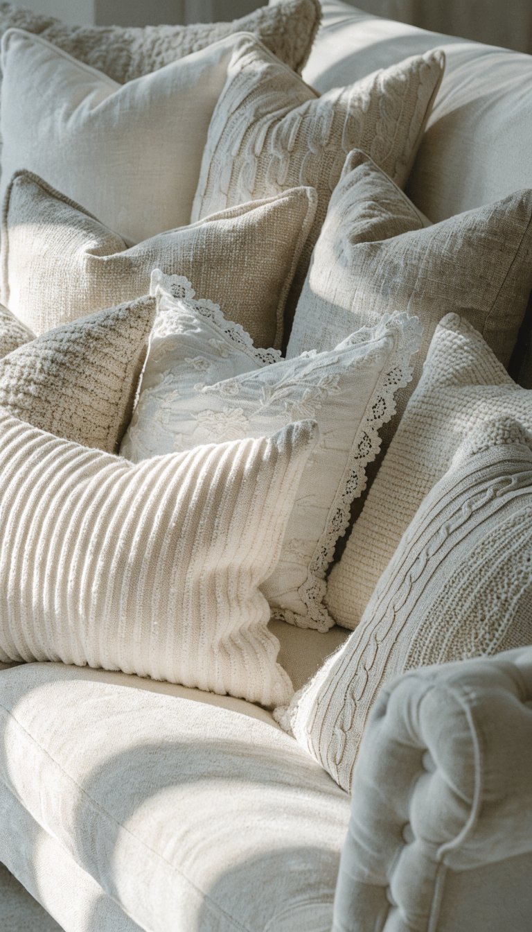
Want to know the biggest mistake people make with neutral decor? They forget about texture and end up with a room that looks like a beige blob. Don’t be that person.
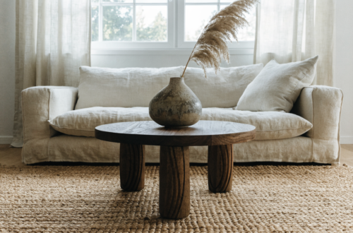
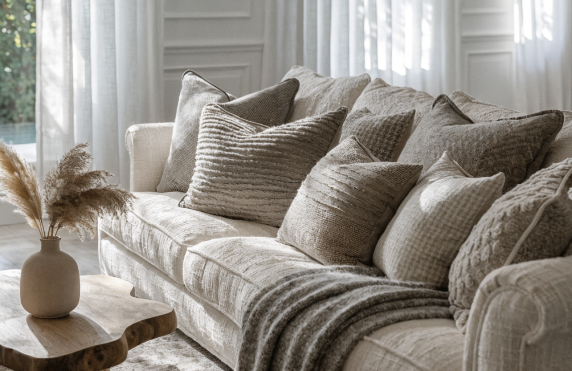
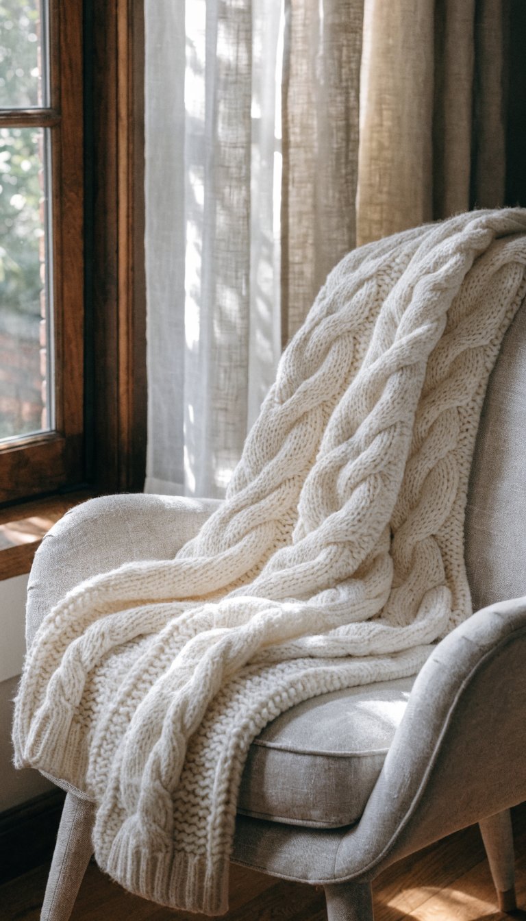
Mixing textures is what transforms neutral from boring to breathtaking. Combine smooth with rough, soft with hard, matte with glossy. A linen sofa paired with a chunky knit throw, velvet pillows, a jute rug, and smooth ceramic vases—now you’re cooking.
Natural materials are your best friends here. Wood, stone, rattan, wool, cotton, and leather all bring their own unique textures to the party. Each catches light differently and adds visual depth without introducing new colors.
Layer, Layer, Layer
Think of texture like you’re getting dressed for unpredictable weather. You wouldn’t wear just one thick coat—you’d layer a shirt, sweater, and jacket. Same concept applies to your room. Start with foundational textures (like your rug and curtains), add mid-weight textures (furniture upholstery), then finish with detailed textures (throw pillows, blankets, decorative objects).
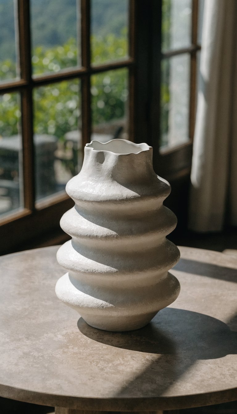
Natural Elements and Organic Shapes
Nothing says “quiet luxury” quite like bringing the outdoors in. Natural elements ground your neutral palette and make spaces feel alive without being loud about it.
Plants are the obvious choice, and yeah, they’re kind of having a moment (okay, a decade-long moment). But seriously, greenery adds life and improves air quality while maintaining that peaceful vibe. Even if you have a black thumb, there are low-maintenance options like snake plants or pothos that practically thrive on neglect.
Don’t stop at plants though. Consider these natural additions:
- Driftwood or branches in a simple vase
- Stone or marble trays and bowls
- Woven baskets for storage
- Ceramic pottery with organic, irregular shapes
- Natural fiber rugs like jute, sisal, or wool
The key is choosing pieces with imperfect, organic shapes rather than rigid geometric forms. Curves and irregular edges feel more calming than sharp angles and perfect symmetry.
Lighting Makes or Breaks the Mood
You can nail everything else and still end up with a space that feels off if your lighting sucks. FYI, that single overhead light fixture isn’t doing you any favors.
Layer your lighting just like you layer textures. You need ambient lighting (overhead or general room lighting), task lighting (reading lamps, under-cabinet lights), and accent lighting (table lamps, candles, decorative fixtures). This creates depth and lets you adjust the mood depending on the time of day.
Warm-toned bulbs are essential for neutral spaces. Cool white bulbs can make your carefully chosen warm neutrals look dingy or gray. Aim for bulbs in the 2700K-3000K range for that cozy, inviting glow.
Don’t Underestimate Candles
I’m not just talking about the light here—unscented or lightly scented candles add both ambient light and visual interest. Group them on trays or shelves for impact. The flickering light creates movement and warmth that no electric bulb can match.
Furniture Selection and Placement
When choosing furniture for your neutral haven, think quality over quantity. Fewer, better pieces will serve you way better than cramming in lots of mediocre stuff.
Look for furniture with clean lines and comfortable proportions. Overstuffed, bulky pieces can overwhelm a calm space, while too-minimal furniture might feel cold. You’re aiming for that Goldilocks zone—just right.
Consider these guidelines:
- Choose low-profile furniture to make ceilings feel higher
- Leave breathing room between pieces—not everything needs to touch the walls
- Mix furniture materials (wood, upholstered, metal) for variety
- Invest in pieces with interesting details like turned legs or textured upholstery
Negative space is actually a design element, not a mistake. Resist the urge to fill every corner. Empty space gives your eyes (and mind) a place to rest.
The Finishing Touches That Matter
Okay, so you’ve got your colors, textures, and furniture sorted. Now comes the fun part—styling your space with accessories that add personality without creating chaos.
Books are underrated decor elements. Stack them on coffee tables, arrange them on shelves, or use them to add height under plants or sculptures. They add visual weight and intellectual coziness that neutral spaces love.
Art doesn’t need to be colorful to be impactful. Black and white photography, abstract neutral paintings, or simple line drawings maintain your color scheme while adding personality. IMO, one large piece makes more impact than a dozen small ones scattered around.
Keep surfaces relatively clear. Choose a few meaningful objects rather than displaying everything you own. A beautiful ceramic bowl, a stack of books, and a small plant beats a cluttered collection of random stuff any day.
Frequently Asked Questions
Won’t an all-neutral home look boring or bland?
Only if you skip the texture and depth! The secret to interesting neutral spaces is layering different materials, textures, and shades. When you mix smooth ceramics with chunky knits, rough wood with soft linen, and various tones from cream to charcoal, you create visual interest without needing bright colors. Think of it like cooking—you can make an amazing dish with subtle flavors if you use the right techniques.
How do I add personality to a neutral space?
Personality comes from your choices in texture, shape, and the specific objects you display. Your book collection, travel souvenirs, unique furniture pieces, and art all inject “you” into the space. The neutral backdrop actually lets these personal touches shine more than they would competing with bold wall colors. Your grandmother’s vintage vase or your ceramics collection becomes the star of the show.
Can I mix warm and cool neutrals?
You can, but it’s tricky and requires a good eye. It’s generally easier to stick within one temperature family (all warm or all cool). However, if you’re set on mixing them, use one as the dominant temperature (say, 80% warm neutrals) and sprinkle in the other as small accents. A cool gray throw pillow can work on a warm beige sofa, but painting half your walls warm beige and half cool gray will probably look disjointed.
What’s the easiest way to start transitioning to neutral decor?
Start with your largest elements first—paint walls, choose neutral furniture, select neutral window treatments. These create your foundation. Then gradually swap out colorful accessories for neutral ones as your budget allows. You don’t need to replace everything overnight. Begin with one room and let it evolve naturally. Your wallet and your stress levels will thank you.
How do I keep a neutral home from feeling cold or sterile?
Warm it up with natural materials, varied textures, and warm-toned lighting. Wood furniture, wool rugs, linen curtains, and warm white light bulbs all add coziness. Also, don’t go too minimal—you need enough furnishings and accessories to make the space feel lived-in. A completely empty room might look like a hospital, but a thoughtfully styled neutral room feels like a luxury hotel.
Are there any neutrals I should avoid?
Builder-grade beige (that yellowish, flat beige from the 90s) tends to look dated and cheap. Similarly, that cool gray that was everywhere in 2015 is starting to feel overdone. Instead, look for richer, more complex neutrals—greiges (gray-beige hybrids), warm taupes, soft whites with undertones, or even deeper charcoals. Test paint samples in your actual space before committing because neutrals can look surprisingly different in various lighting conditions.
Conclusion
Creating a beautiful, quiet home with neutral decor isn’t about playing it safe—it’s about being intentional. When you thoughtfully layer textures, incorporate natural elements, and choose quality over quantity, neutral spaces become sophisticated sanctuaries rather than boring beige boxes. The beauty of this approach is its flexibility and timelessness. You won’t wake up in five years wondering why you painted your walls that particular shade of coral. Start with the basics, add layers gradually, and trust your instincts. Your calm, beautiful space is waiting.