Stuck in a beige rut? Drowning in a sea of greige? Let’s be real, sometimes you just need a serious splash of something more. Forget the safe, forget the subtle, and let’s dive headfirst into the glorious, multi-faceted world of blue room decor. It’s not just a color; it’s a mood, an attitude, and frankly, a design superpower. Get ready to transform your space from “meh” to “marvelous.”
Why Blue? It’s Not Just a Color, It’s a Vibe
So, why blue? Because it’s the ultimate chameleon of the color wheel, that’s why. It can be calming, invigorating, sophisticated, or playful, often all at once. Think about it: the sky, the ocean, your favorite pair of jeans – blue is everywhere, and for good reason. It evokes feelings of serenity, stability, and even creativity.
Ever notice how blue offices are often associated with productivity? Or how blue bedrooms just *beg* you to relax? This isn’t just a coincidence; it’s psychology at play. Blue has a remarkable ability to lower stress levels and promote a sense of peace. Ditch the frantic energy of other colors and embrace the tranquil embrace of blue.
Picking Your Perfect Blue: More Than Just “Light” or “Dark”
Choosing a blue isn’t like picking a flavor of ice cream (though wouldn’t a “deep sea navy” ice cream be amazing?). You’ve got to consider the mood you’re chasing. Do you want a cozy cocoon or an expansive, airy haven? The shade you choose makes all the difference, so don’t just grab the first blue swatch you see.
Deep & Moody Blues
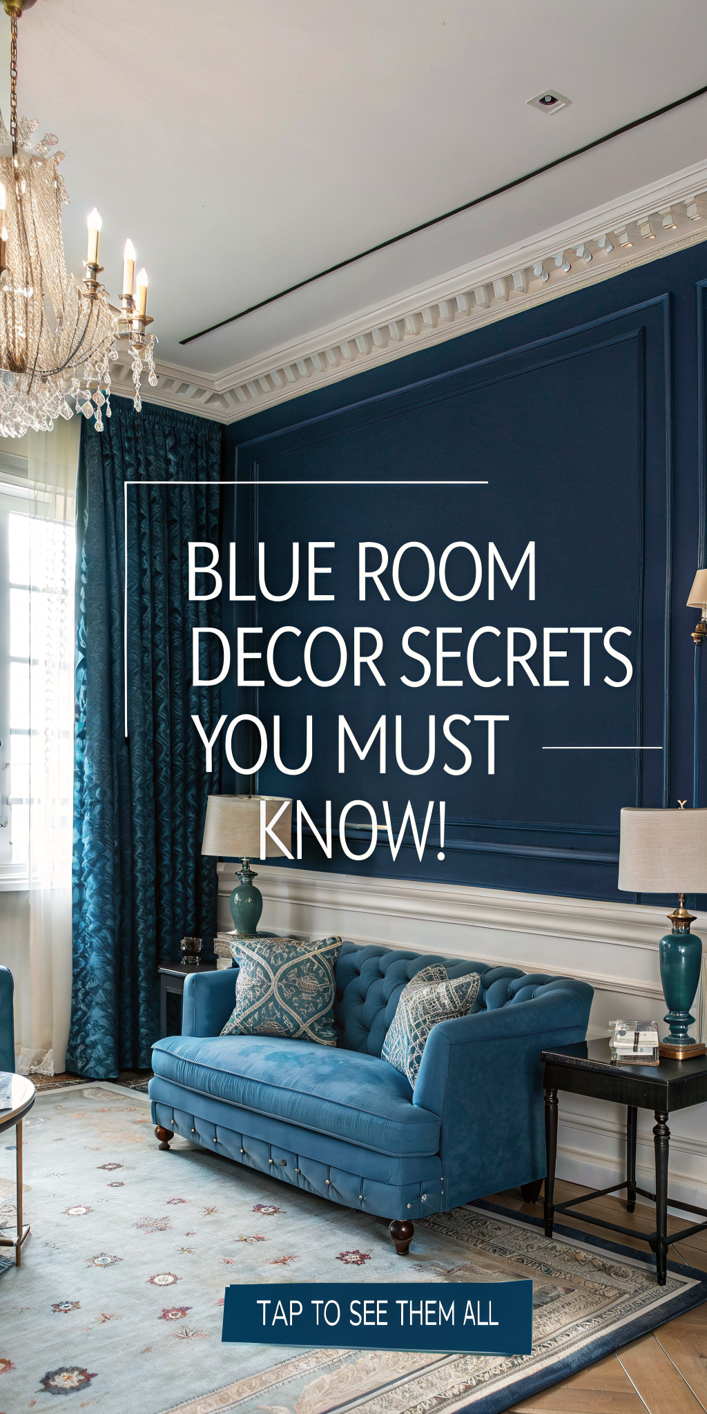
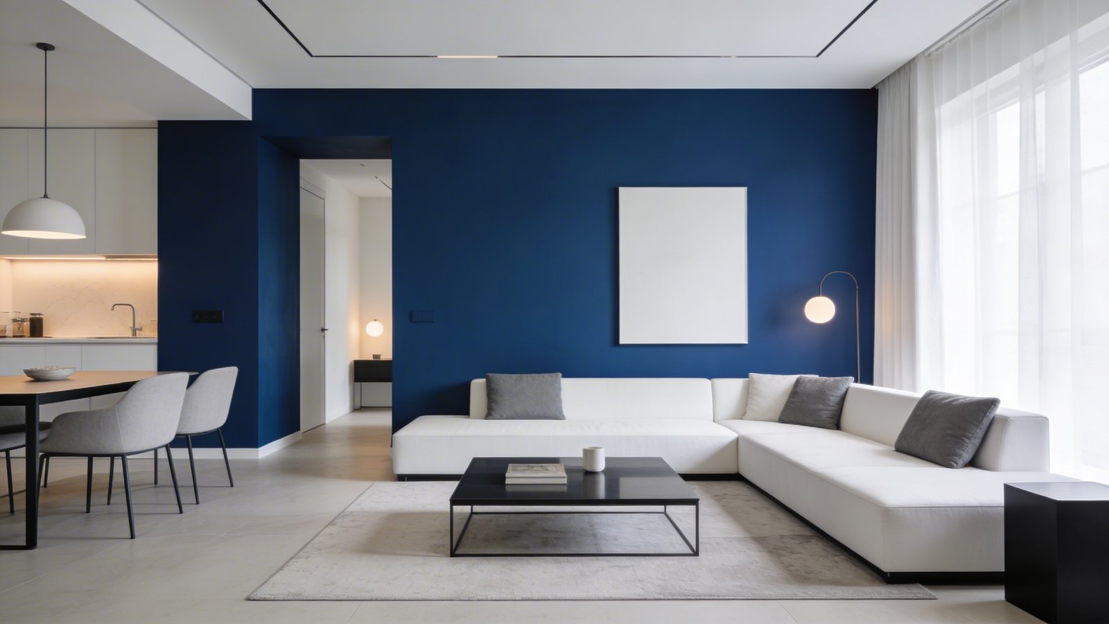
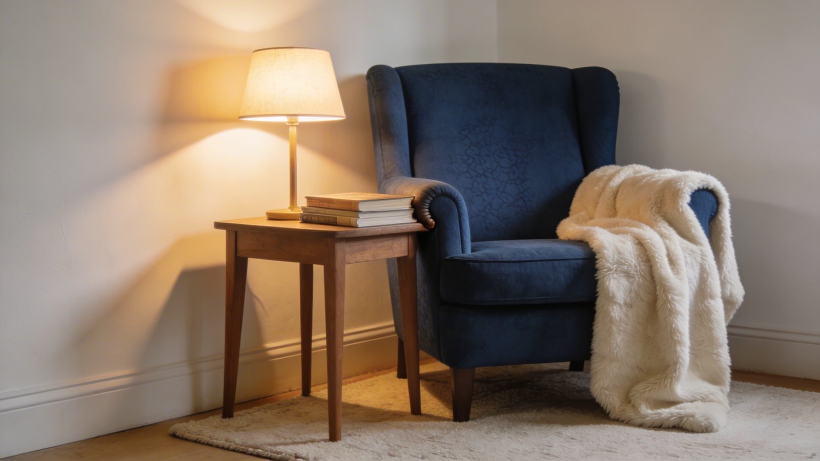
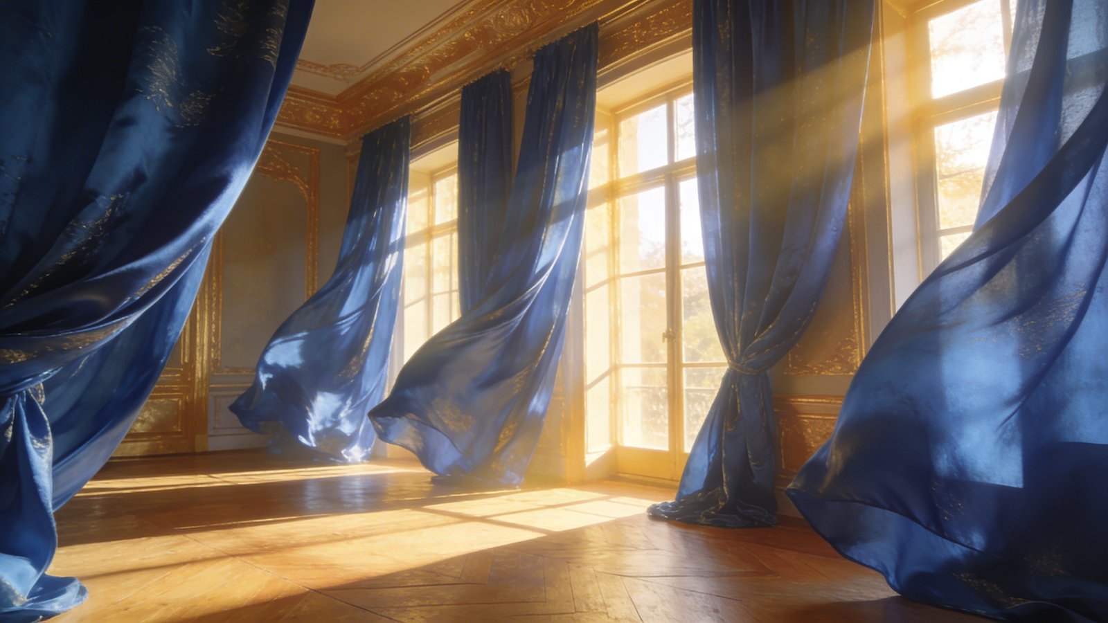
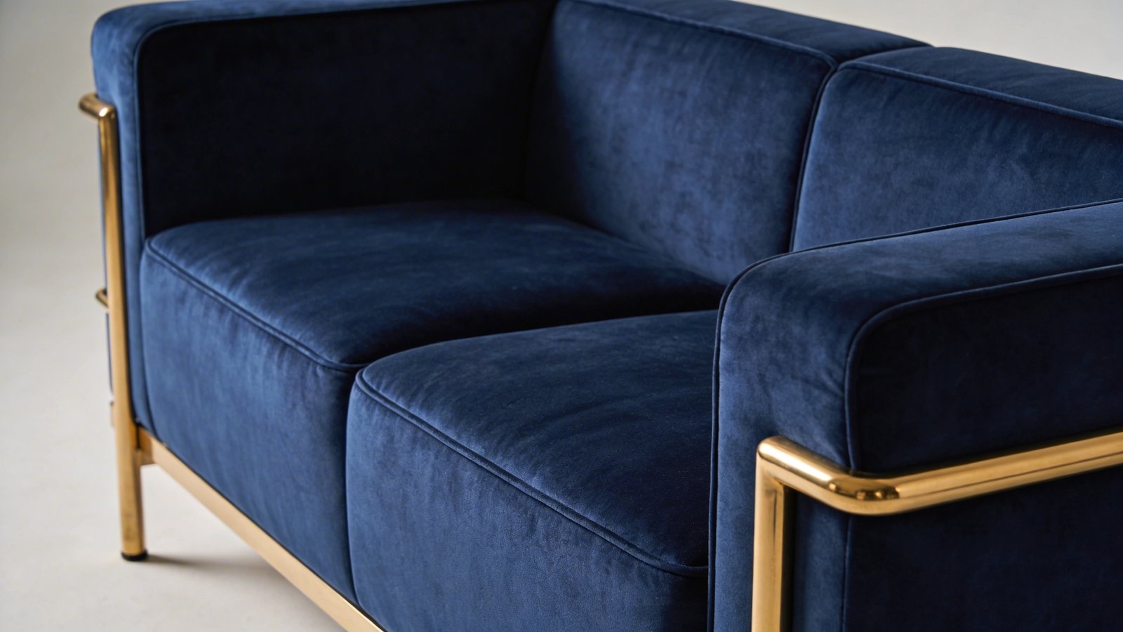
Think navy, indigo, or midnight blue. These are your sophisticated, dramatic players. They create an intimate, luxurious feel, perfect for a bedroom or a cozy den. Pair them with rich textures like velvet or wool for an incredibly opulent look. They’re bold, they’re beautiful, and they make a statement without screaming.
Bright & Breezy Blues
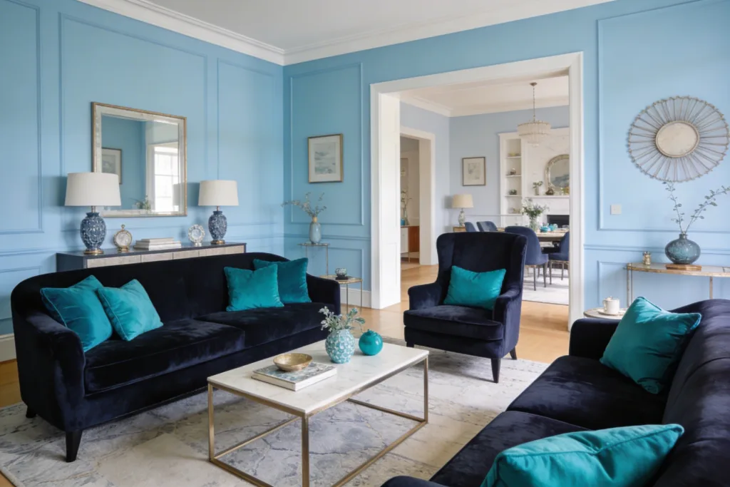
On the flip side, we have the lighter, more vibrant blues. Think sky blue, robin’s egg, or aqua. These shades are fantastic for opening up a space, making it feel larger and airier. They bring a sense of freshness and calm, ideal for bathrooms, kitchens, or any room where you want a light, uplifting atmosphere. They’re basically a breath of fresh air, colorized.
Earthy & Muted Blues
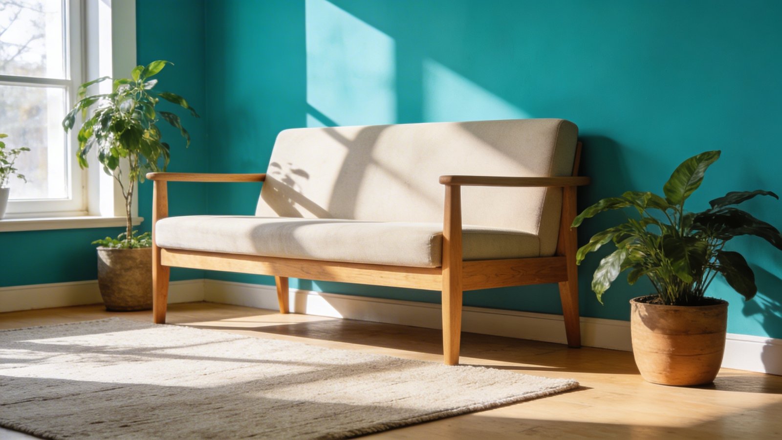
Then there are the blues with a touch of gray or green, like dusty blue, slate blue, or teal. These are incredibly versatile and sophisticated. They offer the calming properties of blue but with a grounded, natural feel. They play well with natural wood tones and earthy textures, creating a serene, organic vibe. IMO, these are the unsung heroes of the blue palette.
Beyond the Paint Can: Weaving Blue Through Your Space
Walls are just the beginning, my friend. To truly embrace blue, you need to think beyond the brushstrokes. How can you layer this magnificent hue throughout your room without turning it into a Smurf village? It’s all about strategic placement and thoughtful choices.
Furniture That Makes a Statement
Imagine a plush navy velvet sofa or a pair of cobalt blue armchairs. Talk about an instant focal point! Blue furniture adds a pop of color and personality without overwhelming the space. It’s a commitment, sure, but a rewarding one. Don’t be afraid to go bold; blue furniture often looks more expensive than it actually is.
Textiles: The Soft Power of Blue
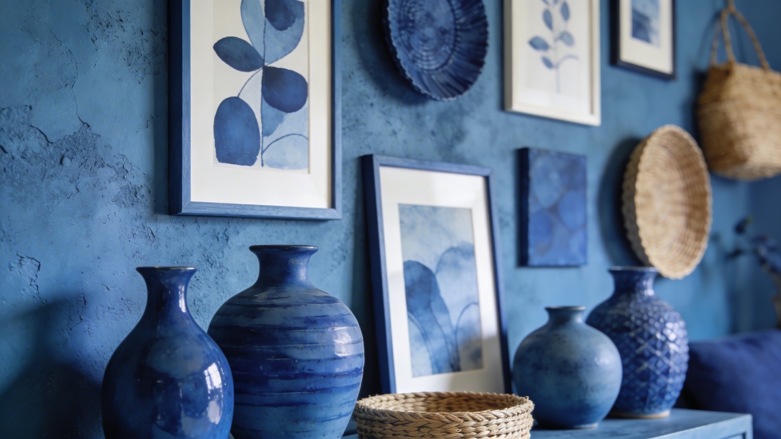
This is where blue truly shines in its versatility. Think throw pillows in varying shades of blue, a chunky knit indigo blanket, or flowing sheer blue curtains. Textiles add warmth, texture, and depth. They’re also a low-commitment way to introduce blue if you’re still testing the waters. Swap them out seasonally or when your mood shifts – easy peasy.
* Rugs: A large area rug with blue patterns can anchor an entire room.
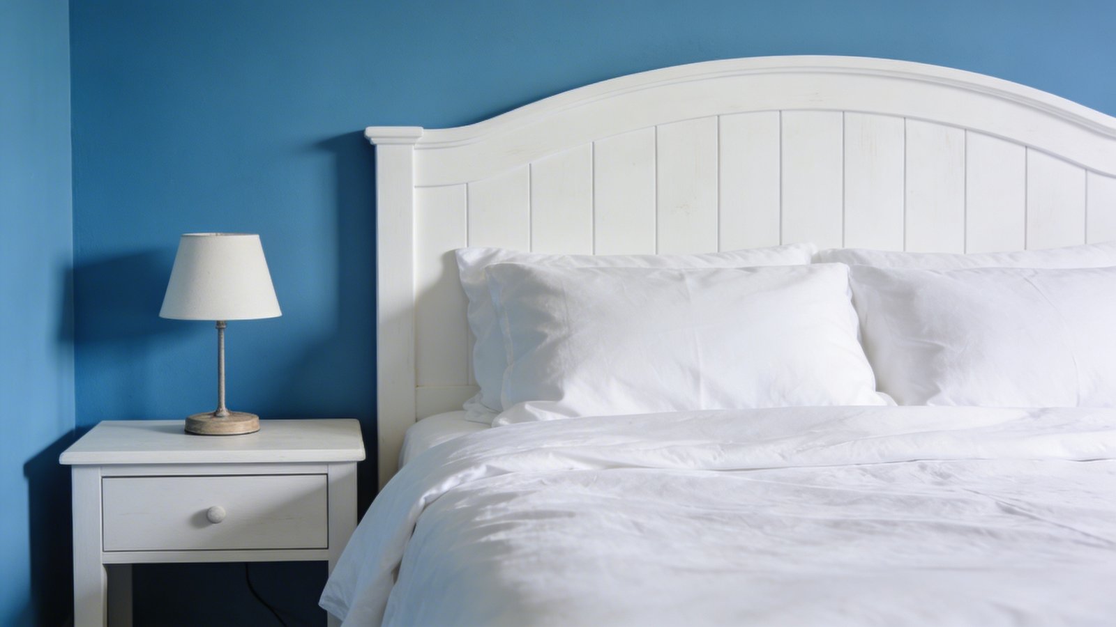
* Bedding: Crisp white sheets with a deep blue duvet cover? Chef’s kiss.
* Towels: Elevate your bathroom with a stack of fluffy spa-blue towels.
Accents & Adornments: The Sparkle and Shine
Once you’ve got your main blue elements in place, it’s time to sprinkle in some magic with accents. These are the little details that elevate your blue room from “nice” to “wow.” Don’t underestimate the power of small touches!
Metallic Marvels
Blue absolutely *adores* metallics. Gold brings warmth and luxury, especially with deep blues. Silver or chrome offers a sleek, modern edge, pairing beautifully with grayer or brighter blues. Even copper or rose gold can add an unexpected, trendy twist. Think gold-framed mirrors, silver lamps, or brass decorative objects.
Natural Elements
To keep blue from feeling too cold (a common misconception, FYI), introduce natural textures. Woven baskets, wooden furniture, rattan accents, and plenty of greenery (hello, houseplants!) will ground the space and add organic warmth. The contrast between cool blue and warm natural elements is simply stunning.
Lighting the Way: Setting the Mood with Blue
Lighting isn’t just about seeing; it’s about feeling. In a blue room, the right lighting can enhance the mood exponentially. You wouldn’t want harsh, fluorescent lights ruining your serene blue haven, would you?
Layer your lighting. Use a combination of overhead lighting (dimmable, please!), task lighting (like a reading lamp), and accent lighting (think ambient floor lamps or string lights). Warm-toned bulbs are generally preferred for blue rooms, as they prevent the space from feeling too stark.
FAQs About Blue Room Decor
Is blue only for bedrooms?
Absolutely not! While blue is fantastic for promoting sleep and relaxation in bedrooms, it’s incredibly versatile. Lighter blues are wonderful for bathrooms and kitchens, creating a clean, fresh feel. Deeper blues can add sophistication to living rooms or home offices. Even a bold blue entryway can make a powerful first impression. Don’t limit its potential!
Can blue make a room feel cold?
This is one of the biggest myths about blue! While some very pale or icy blues *can* lean cool, the vast majority of blue shades, especially those with gray or green undertones, feel incredibly warm and inviting. Pairing blue with warm elements like wood, rich fabrics, and warm lighting prevents any chill. Think cozy cabin, not arctic tundra.
What colors *don’t* go with blue?
Honestly, blue is pretty forgiving. There are very few colors that truly clash with blue. However, some combinations might feel less harmonious or dated. For instance, too much primary red and primary blue can feel a bit childlike. Generally, avoid overly bright, clashing neons unless you’re intentionally going for a very specific, eclectic vibe. When in doubt, stick to neutrals, metallics, and other natural tones.
How much blue is too much blue?
It’s a delicate balance, but you’ll know it when you see it. If your room starts to resemble a single-color paint swatch, you’ve probably gone overboard. The trick is layering different shades and textures of blue, and breaking it up with complementary colors and neutrals. A good rule of thumb: aim for about 60% main color (blue), 30% secondary color (a neutral or complementary shade), and 10% accent color.
Is blue decor trendy or timeless?
Blue is unequivocally timeless. While specific shades might trend (hello, dusty blue!), the color itself has been a staple in interior design for centuries. It’s universally appealing, calming, and adaptable. Investing in blue decor is a safe bet, as it’s unlikely to go out of style anytime soon. It’s a classic for a reason.
Embrace the Blue-tiful!
There you have it. Blue room decor isn’t just a trend; it’s a lifestyle choice. It’s about creating a space that feels uniquely yours, a sanctuary that calms your soul and inspires your spirit. So go ahead, be bold, be brave, and dive into the beautiful world of blue. Your home (and your stress levels) will thank you.