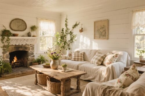
You don’t need a thatched roof or a pet goat to nail the cottagecore vibe. You just need the right colors—and a few cozy textures—to turn your space into a dreamy escape. Below are 15 color palettes that feel like warm tea, freshly baked bread, and long walks through wildflowers. Pick one, mix and match, or rotate by season. Your home, your storybook.
1. Buttermilk & Wild Honey
This palette is sunlight in a jar. Think creamy buttermilk walls, warm wild honey accents, and touches of pale wheat. It’s soft, golden, and ridiculously flattering to everything—from vintage wood to scruffy linen.
Try It Here
- Walls: Creamy off-white with a buttery undertone.
- Textiles: Oatmeal linen curtains, honey velvet pillows.
- Accents: Amber glass, wicker baskets, brass picture frames.
Pro tip: If your room runs cool, this palette adds instant warmth without turning yellow. Keep trim bright white for a crisp contrast.
2. Sage, Moss & Meadow
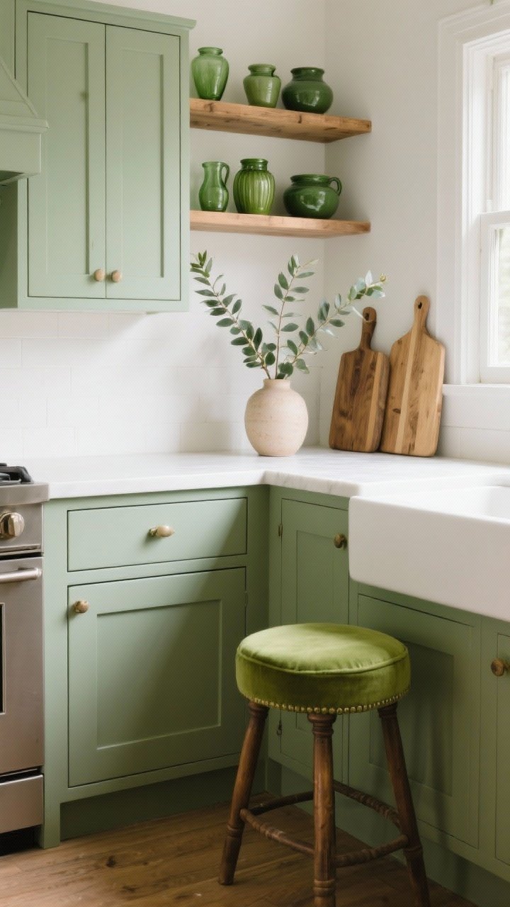
A love letter to greenery. Sage and moss bring calm, while a light meadow green keeps the vibe fresh. It’s the “I garden, or at least I tried” palette.
Where It Shines
- Kitchen: Sage cabinets, white counters, wood shelves.
- Living room: Moss sofa, botanical art, jute rug.
- Decor: Eucalyptus stems, olive pottery, green-tinged glass.
FYI: Mix greens with natural wood to avoid feeling sterile. The imperfections make it cozy.
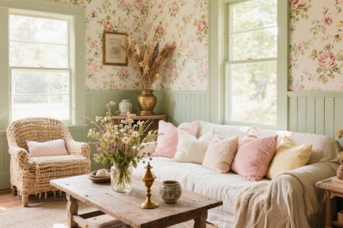
3. Lavender Fog & Dried Lilac
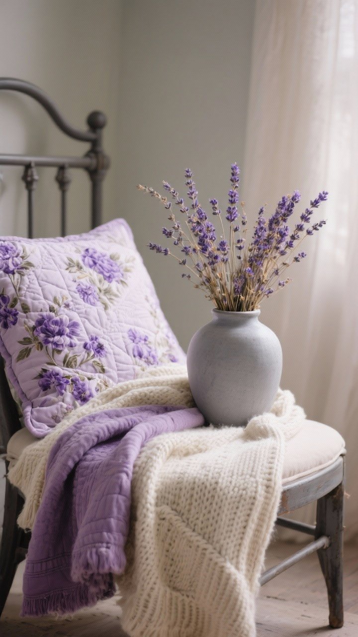
Soft, powdery purples with a hint of romance. Lavender fog pairs beautifully with dried lilac and warm stone. It’s subtle, soothing, and a little nostalgic—in the best way.
How To Use
- Walls: Barely-there lavender.
- Textiles: Floral quilts, lilac throw, cream knit blanket.
- Accents: Ceramics in dove gray, dried lavender bunches.
Balance the sweetness with matte iron hardware or aged brass so it doesn’t go full fairytale princess (unless that’s your brand).
4. Oat, Clay & Terracotta
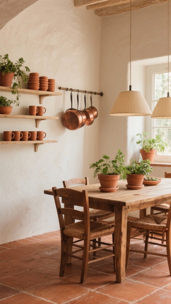
Earthy and grounded, this palette brings a cottage-in-Tuscany energy to any space. Oat keeps things light, while clay and terracotta add warmth and texture.
Design Moves
- Floors: Terracotta tiles or a rug with terracotta accents.
- Walls: Soft oat or ivory to brighten the room.
- Decor: Terracotta planters, clay mugs, copper cookware.
IMO, this palette loves natural light. If your space is dim, add creamy lampshades to keep it glowy, not heavy.
5. Cornflower, Sky & Cream
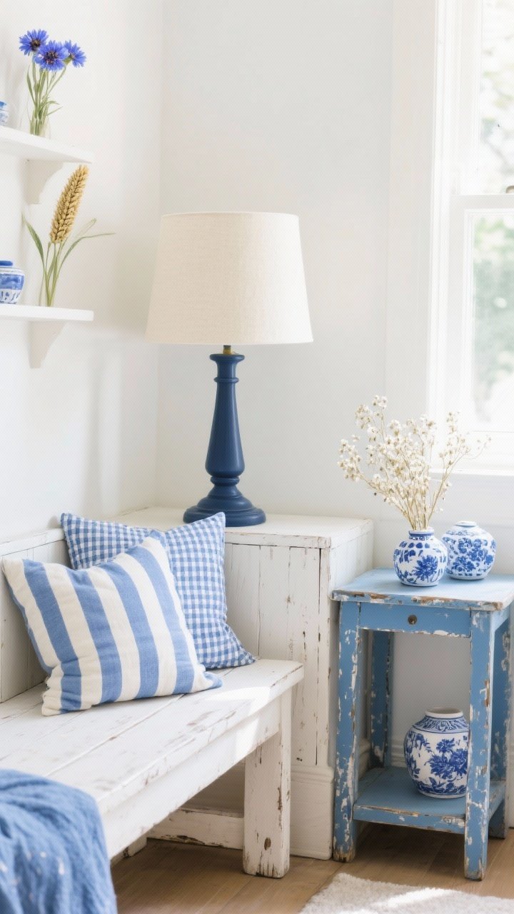
Airy and optimistic. Cornflower blue with sky notes and plenty of cream is perfect for smaller spaces that need to breathe. It nods to vintage enamelware and Sunday mornings.
Quick Wins
- Textiles: Blue gingham, ticking stripes, cream linen.
- Furniture: Whitewashed wood, distressed blue side tables.
- Accents: Blue-and-white ceramics, dried baby’s breath.
For depth, add a touch of navy in a lamp base or picture frame so it doesn’t get too pastel.
6. Rosehip, Blush & Dusty Mauve
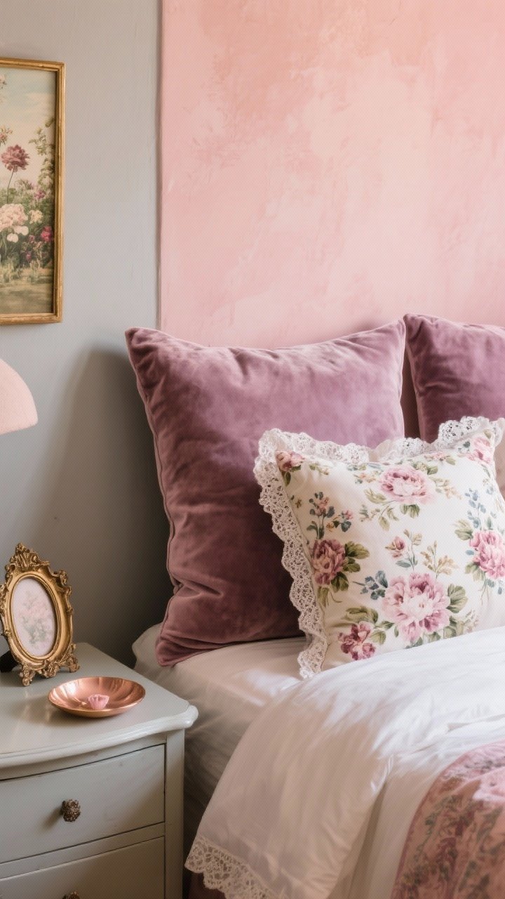
Romantic, but grown-up. Blush and dusty mauve with deeper rosehip accents feel like a faded garden postcard. It’s soft enough for bedrooms, chic enough for dining areas.
Styling Tips
- Walls: Warm blush or greige with pink undertones.
- Textiles: Floral chintz, velvet cushions, lace-trimmed linens.
- Metals: Antique brass or rose gold for warmth.
Add herbs in vintage jars or a gold-framed mirror to ground the pinks.
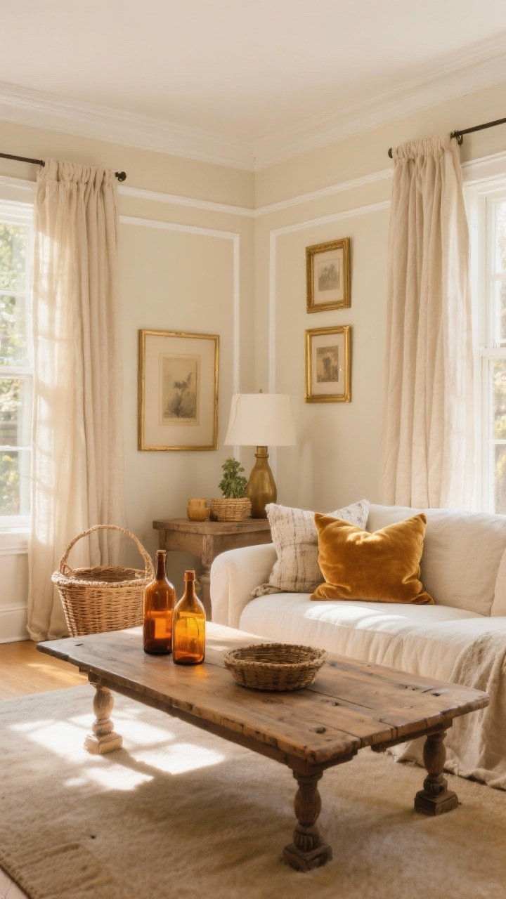
7. Cream, Charcoal & Candlelight
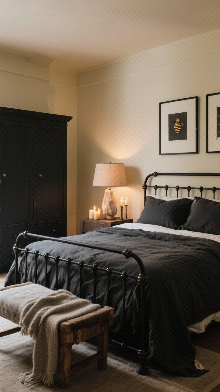
Moody cottagecore? Yes, please. Pair buttery cream with charcoal and warm candlelit tones for a cozy, intimate vibe. It’s like reading by the fire even if you only have candles.
Balance Light and Dark
- Walls: Cream or putty to keep things bright.
- Furniture: Charcoal cabinet, black iron bed, dark picture frames.
- Ambience: Beeswax candles, linen shades, warm bulbs (2700K).
Contrast is your friend—layer textures so the dark tones feel rich, not flat.
8. Fern, Buttercup & Mushroom
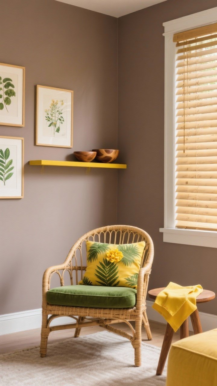
Fresh and cheerful without going neon. Fern green plus buttercup yellow with a mushroom taupe base brings the outdoors in.
How To Pull It Together
- Base: Mushroom walls or rug to ground the palette.
- Pops: Buttercup napkins, green cushions, botanical prints.
- Natural Elements: Rattan, bamboo blinds, wood bowls.
If you’re nervous about yellow, keep it in small accents: tea towels, art, flowers.
9. Faded Denim, Spruce & Hearth Brick
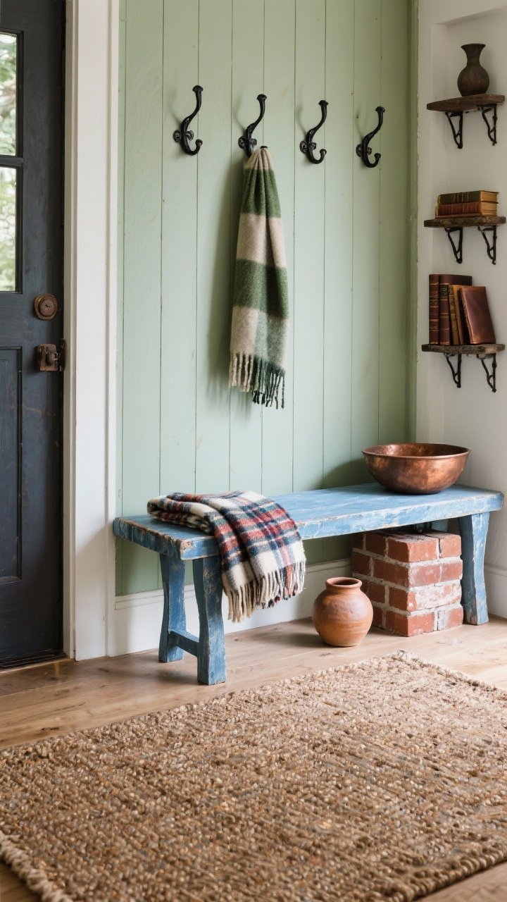
This feels like the most charming lived-in cabin, but make it cottagecore. Faded denim blues meet deep spruce and touches of hearth brick red.
Where It Works
- Entryway: Denim-painted bench, spruce hooks, brick-toned rug.
- Kitchen: Spruce island, denim tea towels, copper pots.
- Living Room: Plaid throw, leather-bound books, brick pottery.
Keep metals rustic: blackened iron, aged copper, and pewter are perfect here.
10. Cream, Pistachio & Vintage Gold
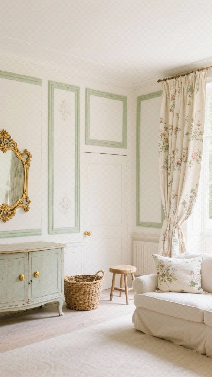
Light, elegant, and a touch fancy. Pistachio is the soft green cousin of mint—less sweet, more timeless. Pair with cream and vintage gold details for a French-cottage mood.
Styling Moves
- Walls: Cream with pistachio trim or vice versa for charming contrast.
- Fabrics: Toile, delicate florals, linen drapes.
- Hardware: Antiqued gold knobs, ornate frames, gilded mirror.
To avoid going formal, throw in a rustic stool or a woven basket to keep it grounded.
11. Pear, Olive & Wheat
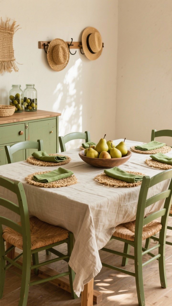
Think orchard in late summer. Pear green brings a sunny lift, olive adds depth, and wheat keeps it cozy. It’s cheerful without being loud.
Use It Like This
- Dining: Olive chairs, pear napkins, wheat linen tablecloth.
- Bedroom: Wheat quilt, olive throw, pear bedside vase.
- Decor: Pears in a bowl (real or faux), olive jars, straw hats on hooks.
Layer with natural fibers: seagrass, cotton, and burlap tones make it feel authentic.
12. Daffodil, Cornsilk & Ivy
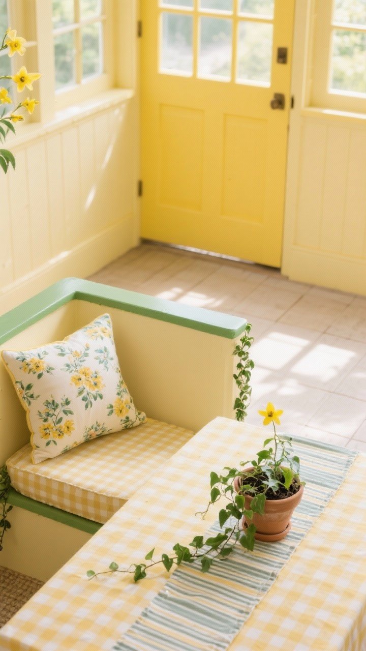
Bright, cottagey, and garden-fresh. Daffodil yellow paired with cornsilk and grounded by ivy green is perfect for sunrooms and kitchens that want to smile.
Small Doses, Big Impact
- Accent Wall: Cornsilk with ivy trim or a daffodil door.
- Patterns: Gingham tablecloth, floral cushions, striped runner.
- Plants: Climbing ivy or pothos to echo the palette.
Keep one element neutral (like flooring) so the brights stay cheerful, not chaotic.
13. Milk, Slate & Blueberry Jam
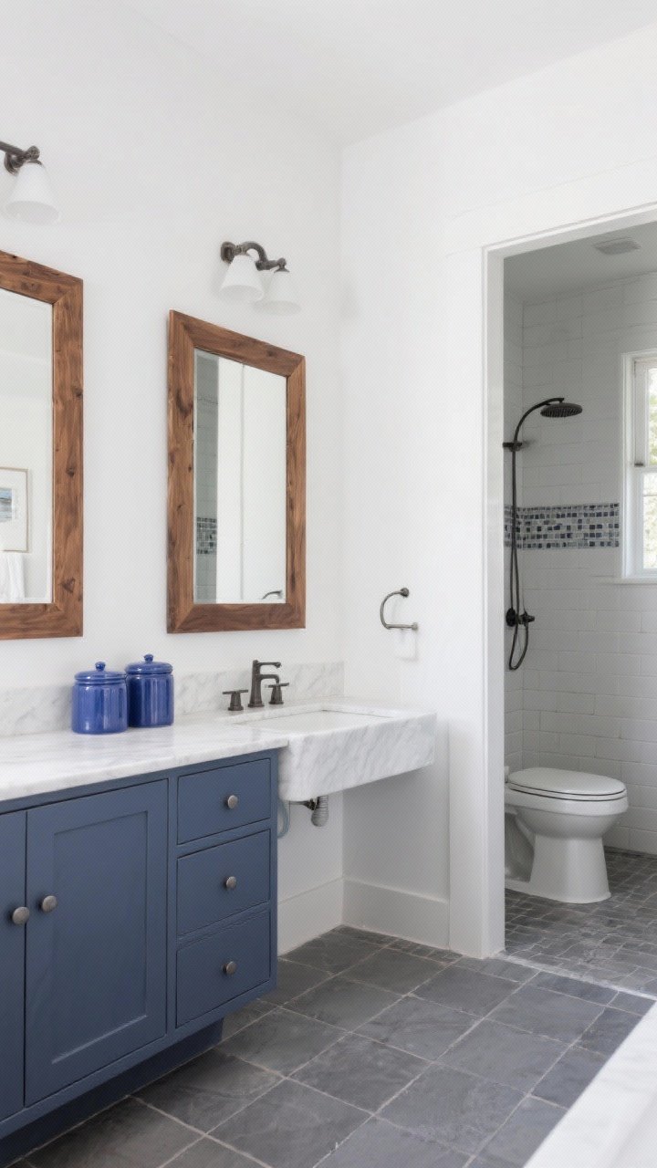
A cool, cozy combo with classic cottage charm. Milk white keeps things clean, slate gray adds depth, and blueberry accents bring a playful, moody pop.
Room Recipes
- Bathroom: Milk walls, slate tile, blueberry vanity.
- Kitchen: Slate counters, white cabinets, blue ceramic canisters.
- Living: Blue plaid throw, slate lamp, white slipcovered sofa.
Warm it up with wood tones—walnut frames or an oak coffee table keep it inviting.
14. Parchment, Ink & Pressed Wildflower
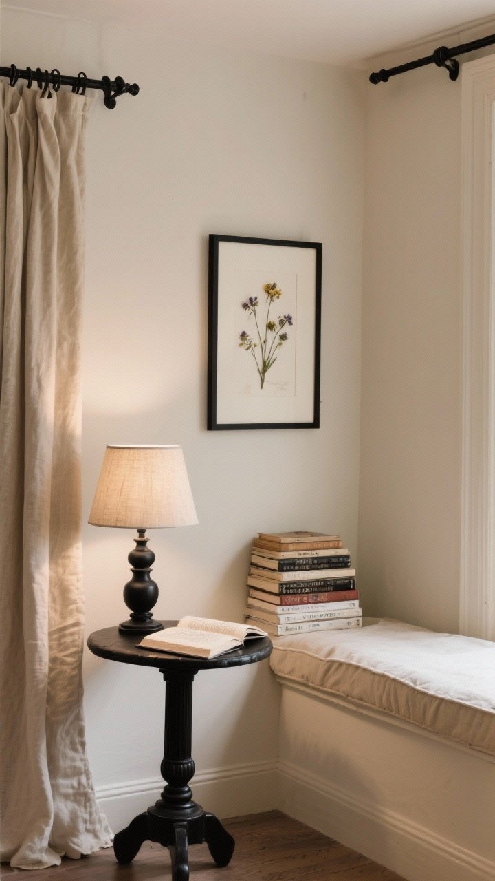
A reader’s dream. Parchment neutrals, inky accents, and pops of pressed wildflower pinks and violets. It feels like an old book with secrets tucked inside.
How To Style
- Walls: Parchment or soft ivory for a bookish base.
- Accents: Black iron curtain rods, ink-colored lamp bases.
- Decor: Pressed flowers in frames, stacked books, linen shades.
Use black sparingly—think punctuation marks, not paragraphs. That’s the key to cozy, not stark.
15. Fog, Mushroom & Candlelit Peach
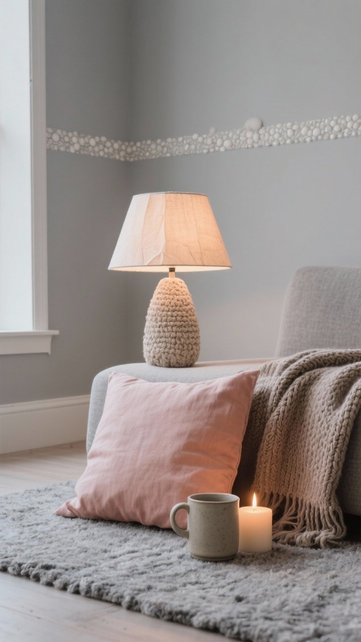
For the minimalist who still wants warmth. Fog gray and mushroom taupe set a calm tone, while a whisper of candlelit peach makes it glow.
Set The Mood
- Walls: Soft fog gray, mushroom trim for subtle contrast.
- Textiles: Peach linen pillow, taupe throw, gray wool rug.
- Lighting: Warm bulbs (2200–2700K), paper or fabric shades.
Keep shapes simple and textures rich: nubby knits, stoneware, and matte finishes. It’s calm, not boring—promise.
Quick Tips For Nailing Any Cottagecore Palette
- Test Paints In Real Light: Swatch big patches and watch them morning to night.
- Layer Textures: Linen, wool, wood, ceramics—mixed textures make soft colors feel intentional.
- Repeat Colors: Echo a hue at least three times in the room for cohesion.
- Patina Over Perfection: A little chippy paint and worn wood instantly ups the cozy factor.
- Plants + Art: Live greenery and botanical prints tie every cottagecore palette together.
Pick the palette that makes you exhale, then build slowly—pillow by pillow, swatch by swatch. Cozy takes time, but once it clicks, your space will feel like a warm hug. Go brew some tea and start with a paint sample. You’ve got this.