Let’s be honest: a gallery wall can either make your space feel curated and calm… or like your living room got trapped inside a flea market. The difference? Smart layout, breathing room, and a little strategy. I’ve got you. Here are 12 gallery wall layouts that bring the cozy, skip the chaos, and make your walls look like they’ve been styled by someone who owns multiple paint swatch decks.
1. The Calm Grid: Symmetry That Soothes
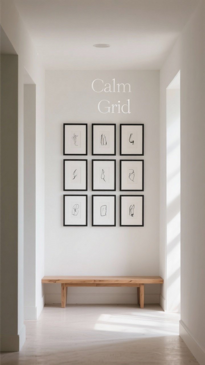
If you want order without feeling stiff, go for a simple grid. Think 4, 6, or 9 frames in identical sizes, spaced evenly so your eye can relax. It’s like a visual deep breath.
Why It Works
- Predictable spacing creates calm and keeps things from looking cluttered.
- Perfect for hallway, office, or above a console where symmetry matters.
Pro Tips
- Use 2 inches between frames for most sizes; go 1.5 inches if your frames are small.
- Choose matching frames and mats for that gallery vibe.
- Keep all art in a similar theme: all black-and-white photos or all sketches.
2. The Soft Column: Vertical Balance Without the Bulk
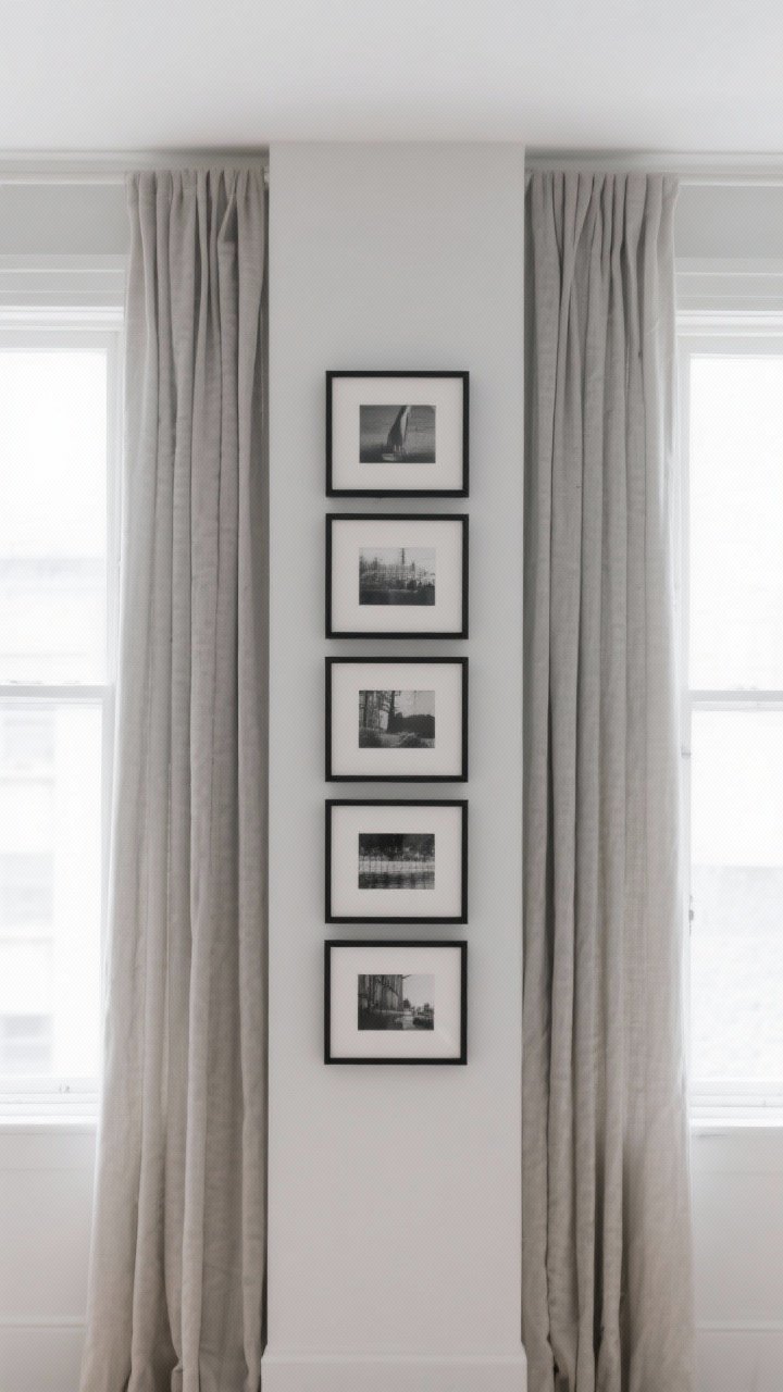
Have a narrow space by a doorway or between windows? Stack a column of frames with soft, consistent spacing. It draws the eye up and makes the room feel taller—no clutter in sight.
Why It Works
- Vertical layouts are naturally tidy and space-saving.
- Ideal for stair landings, small entries, or awkward wall slivers.
Pro Tips
- Keep frames the same width, vary heights for interest.
- Anchor the column with a larger piece at the center or bottom.
- Stick to three to five pieces—odd numbers look more intentional.
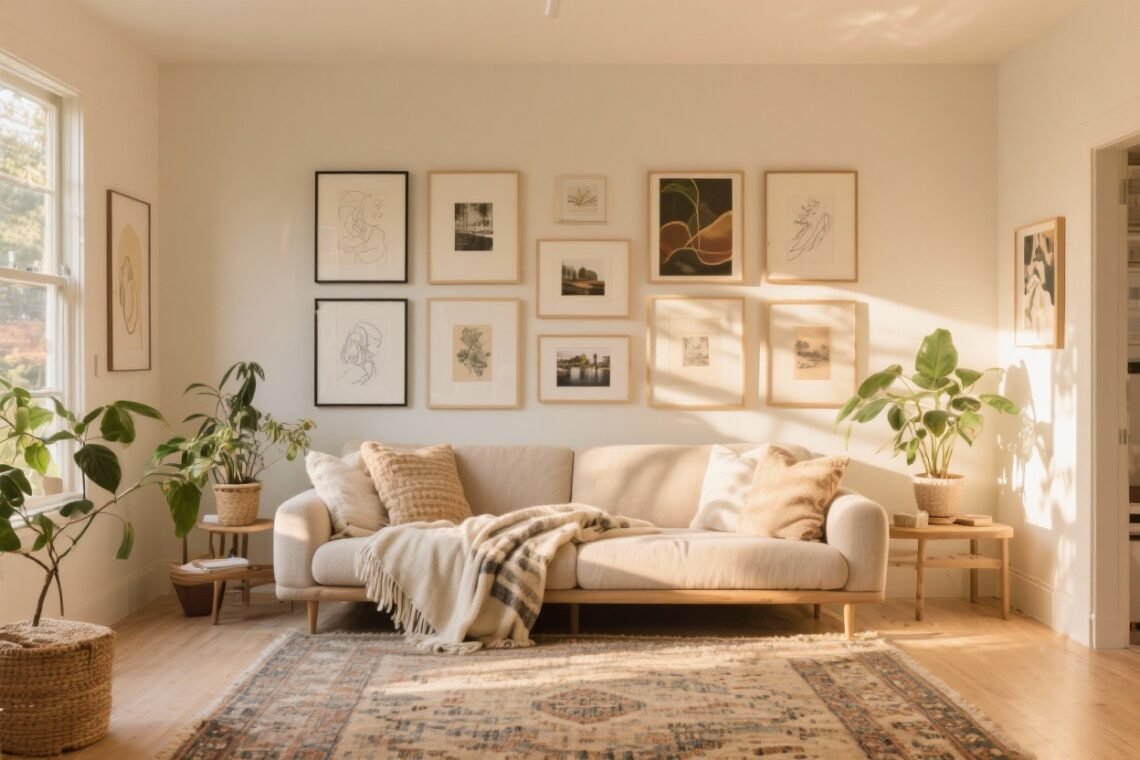
3. Salon Chic: Collected, But Make It Clean
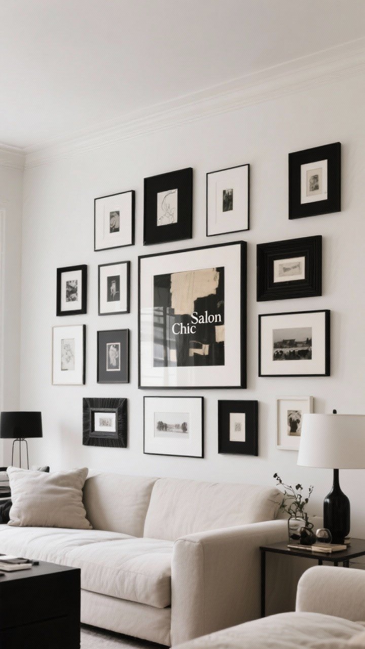
A salon wall can go from charming to chaotic fast. The trick is keeping one thing consistent: color palette, frame tone, or matting. Then let sizes and shapes play.
Why It Works
- It looks curated over time without feeling messy.
- Great for living rooms or dining rooms with character.
Pro Tips
- Choose one unifying element: all black frames or all white mats.
- Start with a visual center—a medium piece at eye level—and build out.
- Maintain consistent spacing (1.5–2 inches) between pieces.
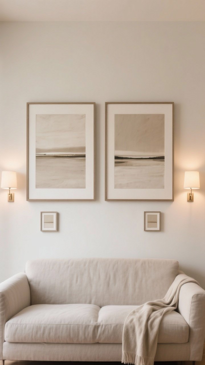
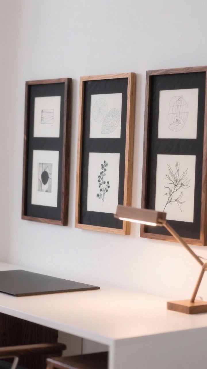
4. The Diptych + Minis: One Statement, A Few Whispers
Pair two large pieces side-by-side, then accessorize with a couple of small pieces nearby. It’s dynamic without feeling busy—like a gallery wall with restraint.
Why It Works
- The diptych gives structure, the minis add personality.
- Excellent above a sofa or bed where you want a focal point.
Pro Tips
- Keep the two main pieces the same size and similar tones.
- Add two to three small frames within the same color palette.
- Maintain a straight top or bottom line for cohesion.
5. Ledge Love: Easy, Adjustable, Effortlessly Cozy
Picture ledges are the low-commitment heroes of gallery walls. Layer frames, lean art, and swap pieces whenever the mood hits—no extra holes, no regrets.
Why It Works
- Layering creates depth and coziness without clutter.
- Perfect for renters or the chronically indecisive (hi, same).
Pro Tips
- Use two ledges, staggered or stacked.
- Mix heights and orientations; keep color palette tight.
- Anchor with one oversized piece and build around it.
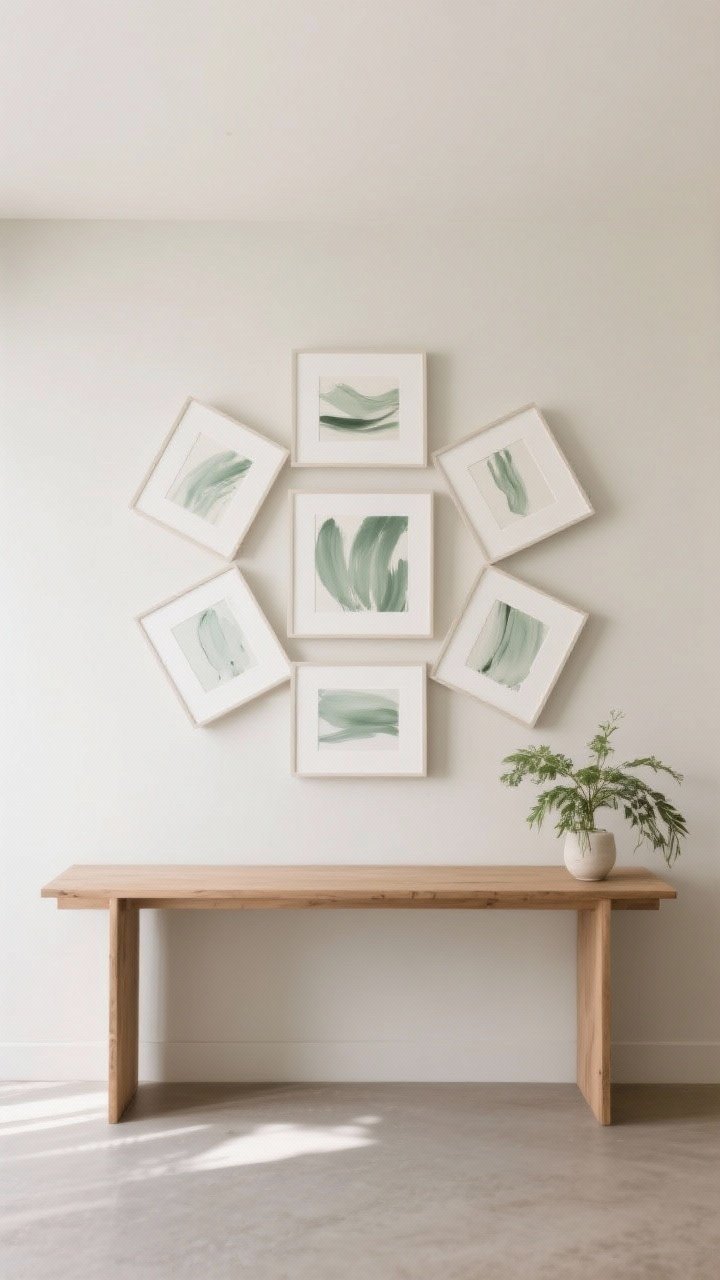
6. The Centered Cluster: Cozy Core, Clean Edges
Group 5–7 pieces tightly in the middle of a wall and leave generous blank space around. The negative space keeps it airy, and the cluster feels intimate and lived-in.
Why It Works
- Negative space = instant calm and balance.
- Great above a console or in a reading nook where scale matters.
Pro Tips
- Keep pieces within an invisible circle or square.
- Use at least two mats to lighten the overall look.
- Repeat a color or motif at least three times for unity.
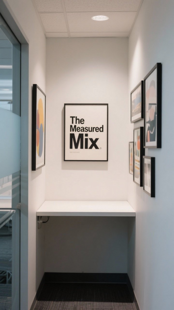
7. The Measured Mix: Matte + Frame Harmony
If you love variety but hate visual noise, let mat sizes and frame widths do the heavy lifting. Different art sizes look cohesive when the borders are consistent.
Why It Works
- Generous mats create breathing room around busy art.
- Mix sizes without the “patchwork” effect, FYI.
Pro Tips
- Choose two frame finishes max (e.g., black + oak).
- Standardize mat width: 2–3 inches for mid-sized art.
- Repeat three sizes throughout for rhythm.
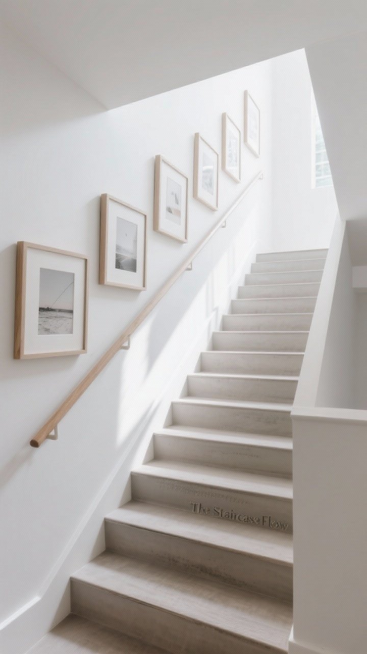
8. The Staircase Flow: Rise And Align
Stair gallery walls can go wild fast. Keep frames aligned along an invisible diagonal line that matches your stair slope, then fill lightly above and below.
Why It Works
- That diagonal line gives movement and order.
- Makes narrow stairwells feel intentional, not cluttered.
Pro Tips
- Pick a baseline along the handrail height; align bottoms or centers to it.
- Use lighter tones and thinner frames to avoid heaviness.
- Keep spacing consistent even as angles change.
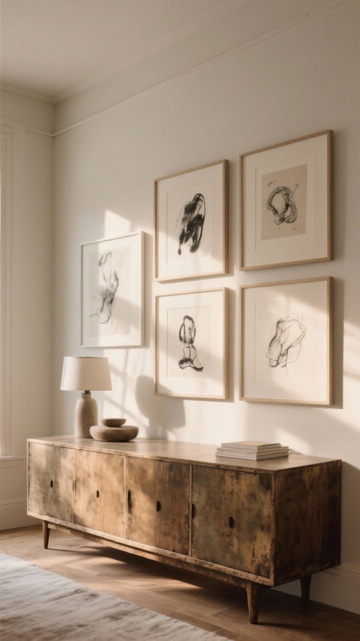
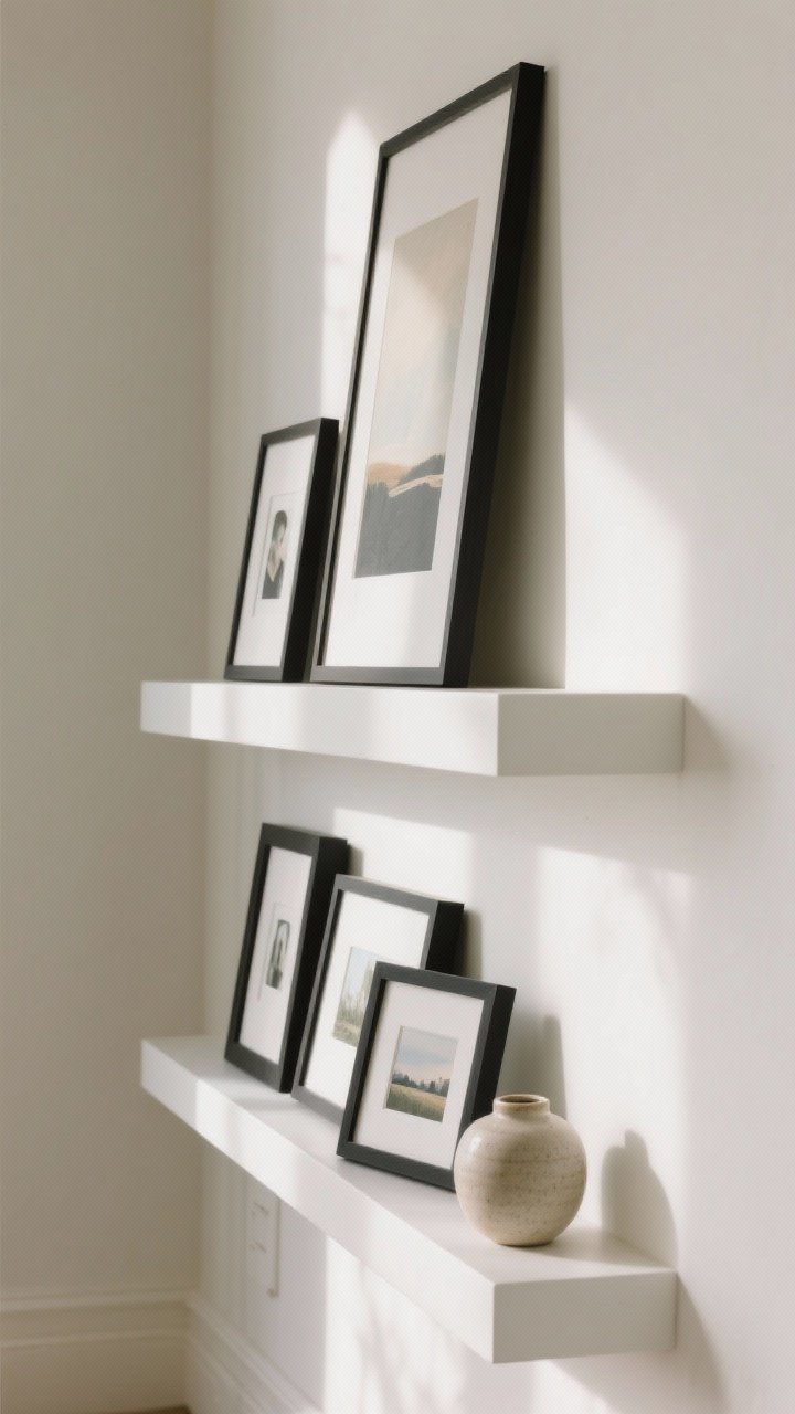
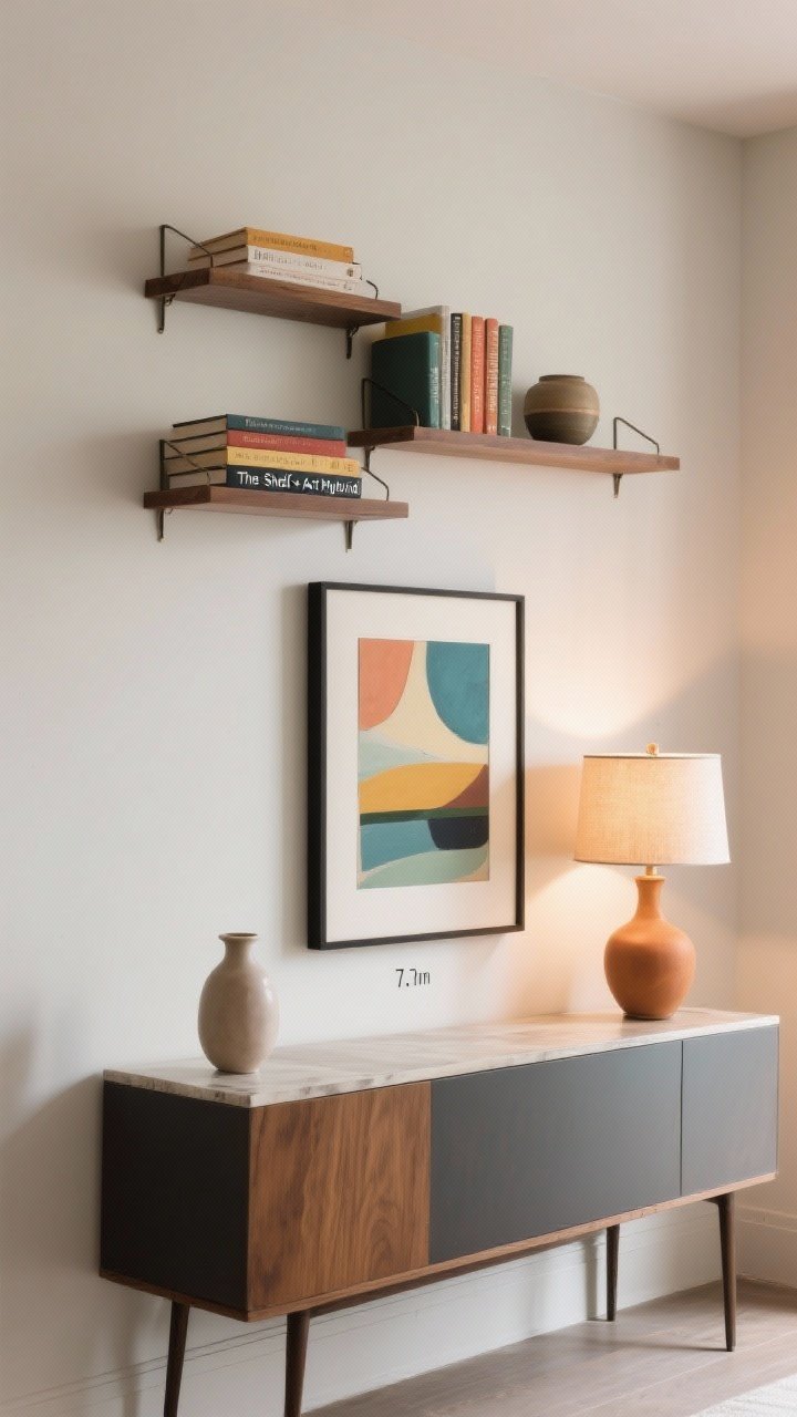
9. The Shelf + Art Hybrid: Styling That Sings
Mix wall-hung frames with a styled shelf or console below. Books, a lamp, and a small vase give the gallery wall context and warmth—cozy without overdoing it.
Why It Works
- Combines vertical and horizontal layers for depth.
- Makes art feel like part of a vignette, not random wall stuff.
Pro Tips
- Hang the lowest art piece about 6–8 inches above the surface.
- Echo colors from the art in books or vessels below.
- Use odd-numbered groupings for shelf styling: 3 or 5 items.
10. The One Big, Three Small: Asymmetry With Intention
Start with one large anchor piece, then add three smaller works around one corner. It’s asymmetry done right—cool, curated, and not at all chaotic.
Why It Works
- Hierarchy keeps your eye from bouncing everywhere.
- Flexible for varying art collections and wall sizes.
Pro Tips
- Place the big piece at eye level and shift the smaller pieces to the right or left.
- Use a consistent frame color for the three smalls.
- Keep a 2-inch gap between all elements.
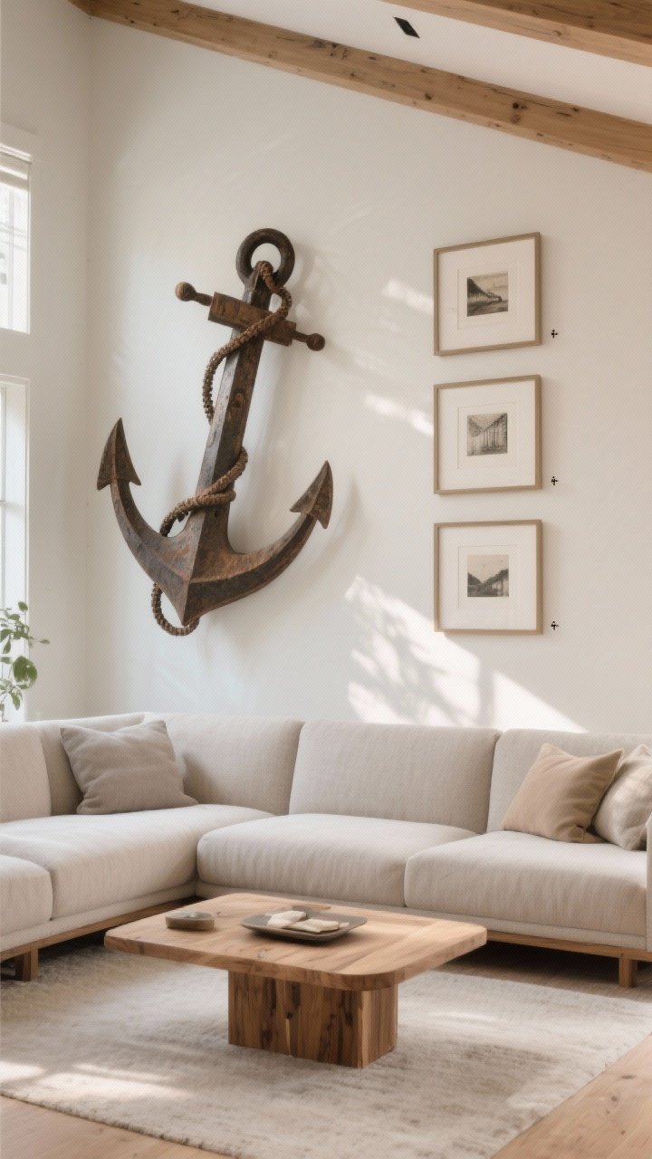
11. The Textural Mix: Frames, Fabric, And Found Objects
Want cozy without more rectangles? Mix in a woven wall hanging, a sculptural piece, or a framed textile. Texture softens the wall and keeps things grounded.
Why It Works
- Different materials add warmth and dimension.
- Breaks up a sea of glassy frames—less glare, more character.
Pro Tips
- Stick to a neutral palette with one accent color for cohesion.
- Balance weight: if the textile is large, pair with lighter, smaller frames.
- Repeat textures—e.g., linen mats + a woven piece—so it feels intentional.
12. The Monochrome Moment: One Palette, Maximum Calm
Keep the art, frames, and mats in a tight color story—think black-and-white photos, black frames, white mats. Monochrome reads clean and high-end without trying too hard.
Why It Works
- Limits visual noise for a quiet, cozy vibe.
- Lets your room’s textures (wood, textiles, plants) shine.
Pro Tips
- Vary scale and orientation so it doesn’t feel flat.
- Use mat boards generously to open up the compositions.
- Hang at 57–60 inches from floor to center for a professional look.
Quick Hanging and Styling Cheatsheet
- Plan with paper: Cut kraft paper to frame sizes, tape to the wall, adjust until it feels right.
- Keep spacing consistent: 1.5–2 inches is your best friend, IMO.
- Mind the scale: Art width above a sofa should be about two-thirds the sofa width.
- Eye-level rule: Center most arrangements at 57–60 inches from the floor.
- Mix finishes thoughtfully: Two frame finishes max for cohesion.
- Edit ruthlessly: If one piece is stealing the vibe, swap it. No mercy.
Frame and Art Sourcing Tips
- Use standard frame sizes (8×10, 11×14, 16×20) with mats to future-proof your layout.
- Balance originals and prints: A few textured or hand-touched pieces add soul.
- Print wisely: For photography, matte or luster paper looks elevated and reduces glare.
- DIY mats: Oversized mats can make small art feel gallery-level, like instant glow-up.
Color and Theme Cohesion
- Set a palette: Pull 2–3 colors from your room (rug, pillows, wood tone) and repeat them.
- Tell a story: Travel photos + maps, botanicals + vintage sketches, family photos + handwritten recipes.
- Repeat elements: A botanical leaf shape that appears in three pieces ties the wall together.
Common Mistakes To Avoid
- Hanging too high: It makes your room feel disjointed. Lower the art, thank me later.
- Too many frame finishes: Keep it to one or two, max.
- Random spacing: Measure once, hang once. Eyeballing leads to chaos, FYI.
- All tiny pieces: Mix sizes so it doesn’t look like a postage stamp collection.
You don’t need a museum to enjoy a perfectly balanced gallery wall—just a plan, a tape measure, and the courage to step back and edit. Start with one layout that fits your space and style, keep the spacing consistent, and let your art breathe. You’ve got this. Your walls are about to feel cozy, collected, and totally you.